What makes it worth reading
How I transformed a 200,000+ MAU kids’ smartwatch companion into a scalable family platform, redesigning the product around people, not devices.
Impact
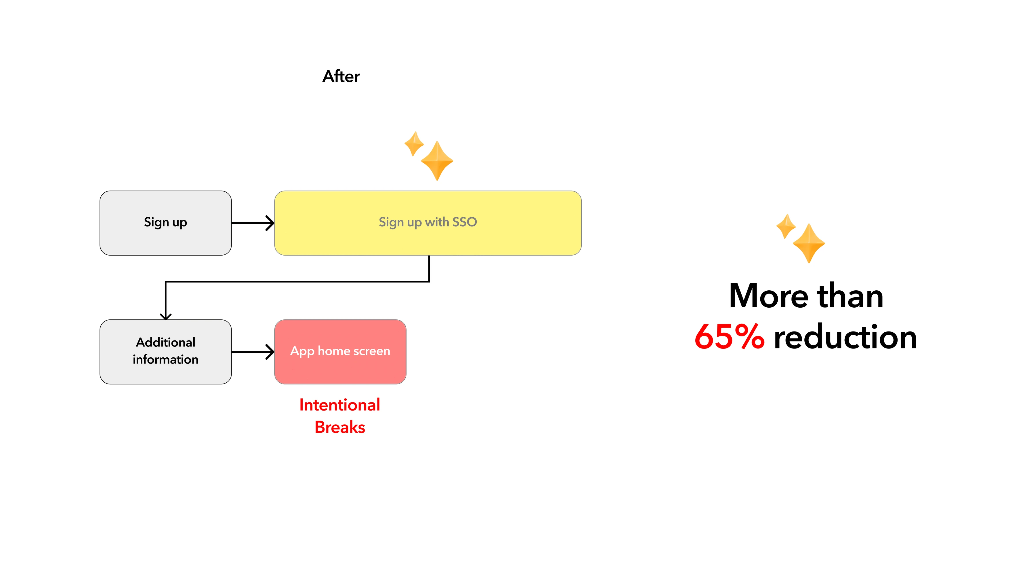
65% ↓ onboarding drop-off
40% ↑ feature engagement
30% adoption
+22% YoY account growth

Project Overview
Role
Senior Product Designer
Scale
200,000+ MAU · 11 countries
Team
Year
2024
Research
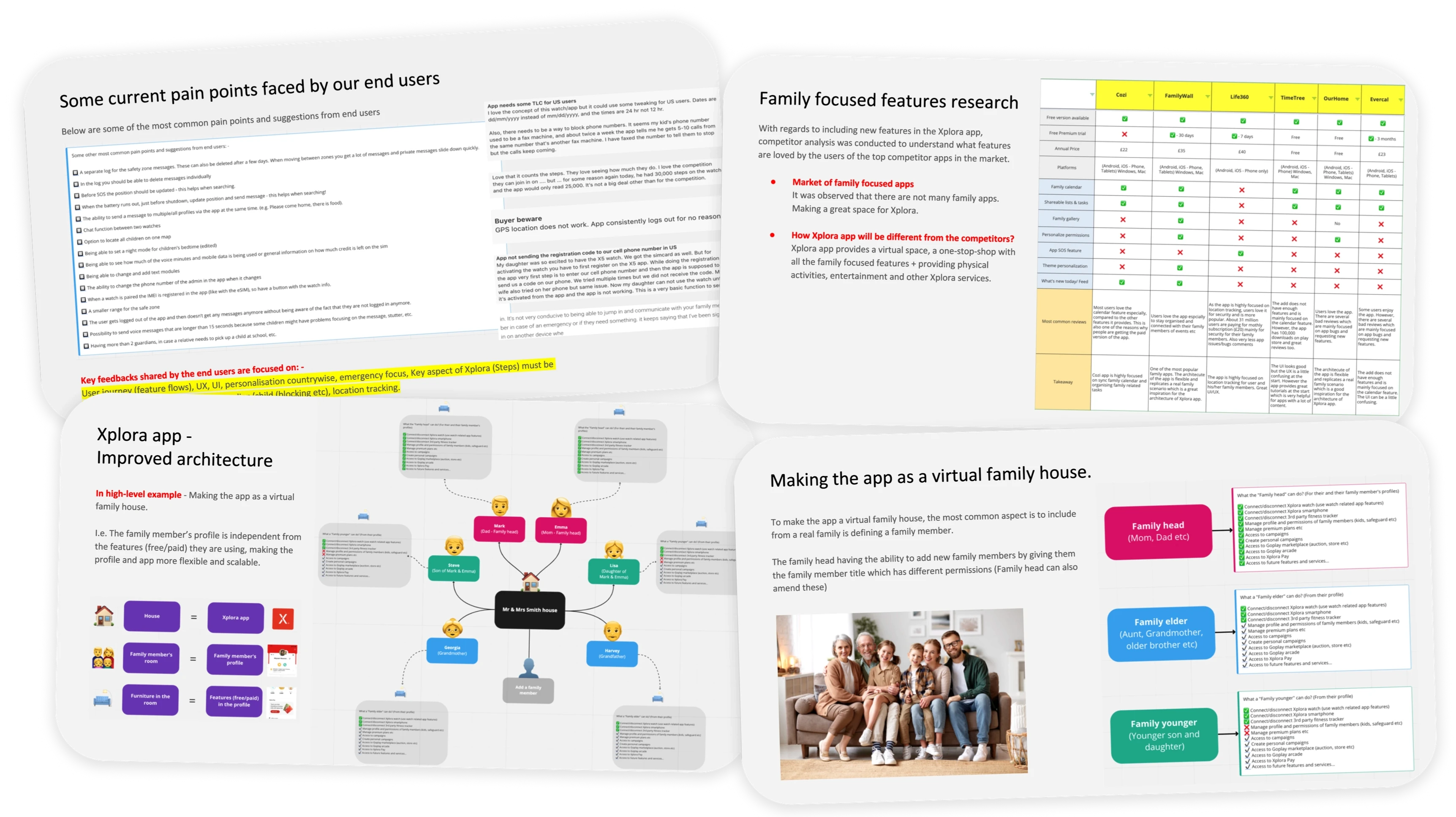
Before redesigning, I combined multiple signals:
01 — Customer feedback: App Store reviews, Customer Support tickets and surveys
02 — Behavioural data: Usage, navigation and drop-off patterns
03 — Competitive benchmarking: Expectations and opportunities
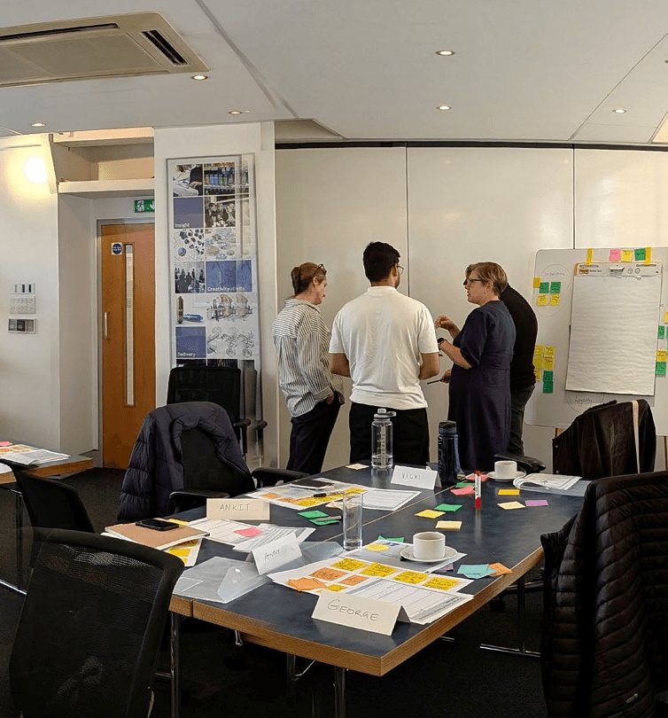
04 — Product audit: Every existing screen mapped with developers
05 — Journey mapping: How parents, kids, teens and seniors would move through the ecosystem.
Looking at these together revealed that the problems weren’t isolated screens.
The app wasn’t the real problem. The model behind it was.

Ideation
Instead of asking: “How do we redesign the existing app?”
We asked: “What should Xplora become next?”
The existing model: Parent → Child → Watch → Features
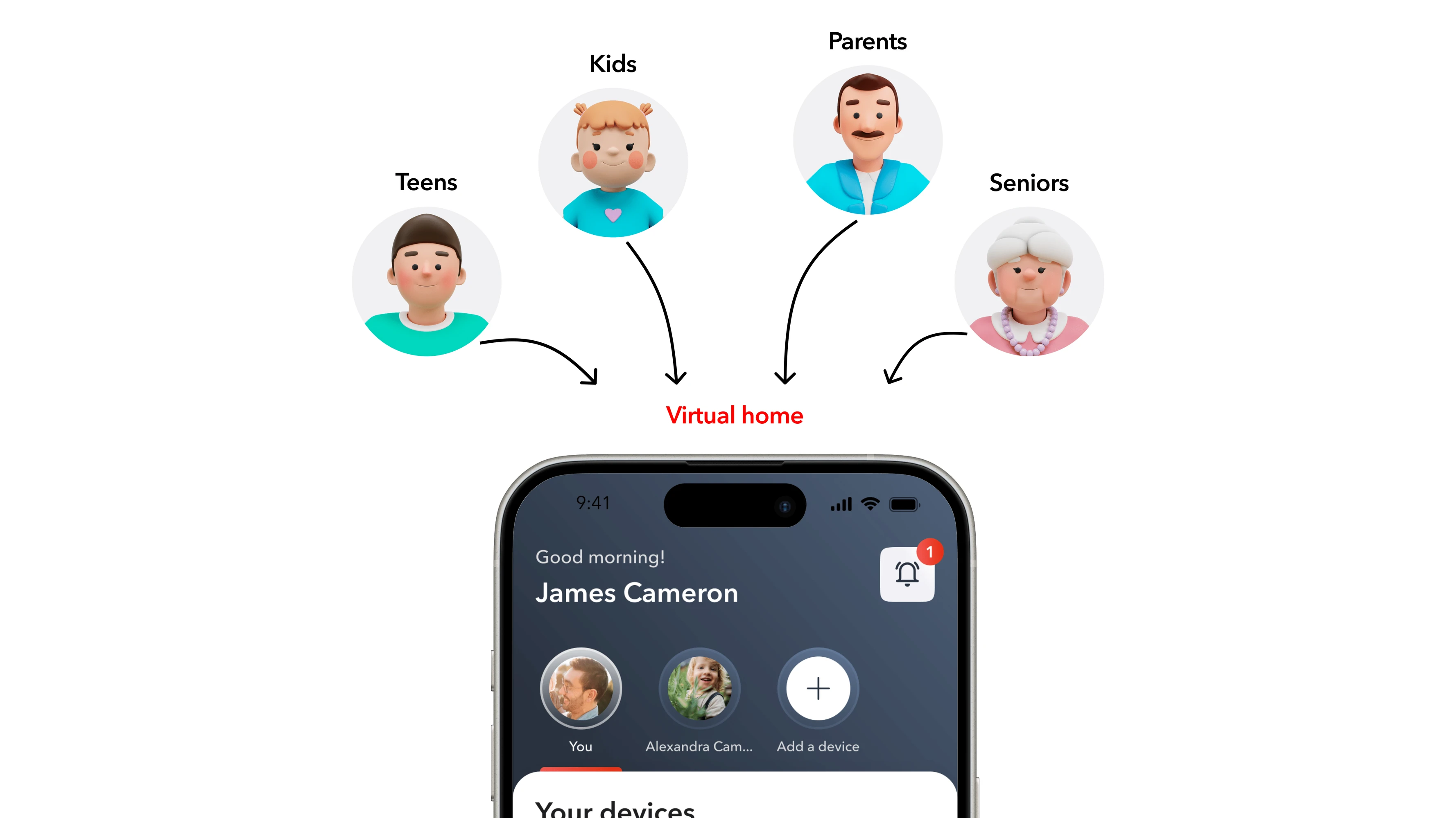
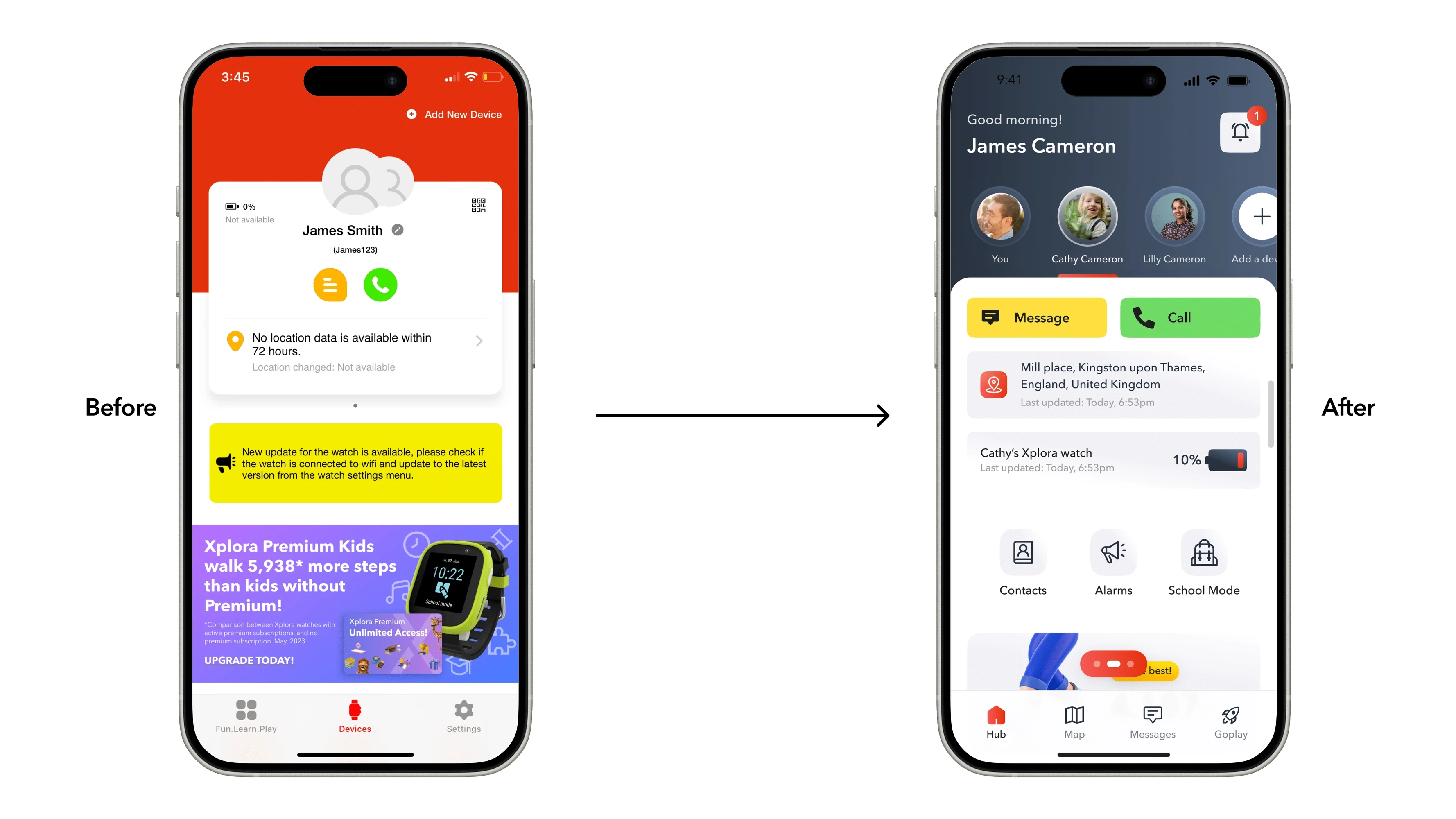
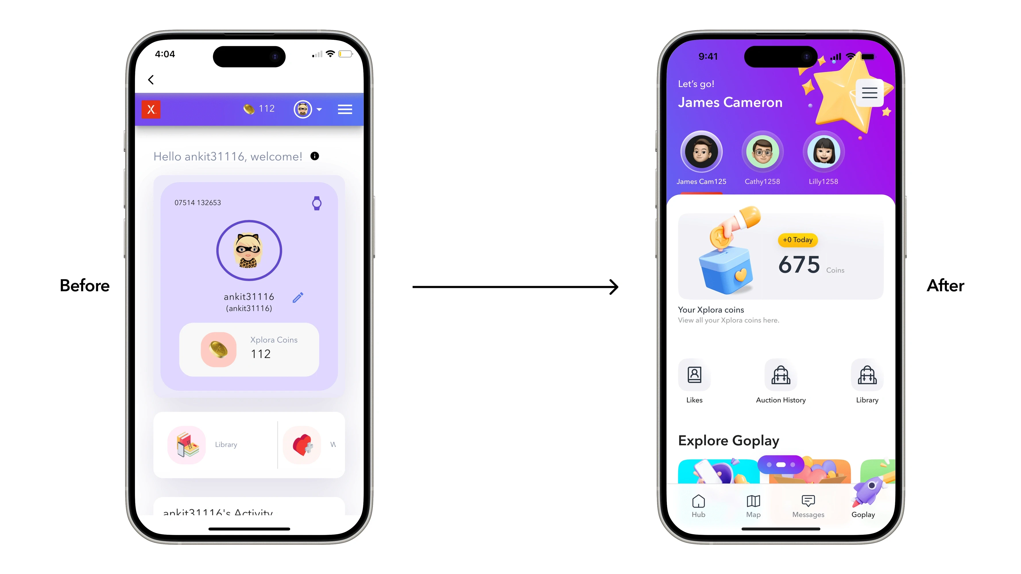
Became: Family → Person → Devices, services & experiences
Putting the person at the centre meant Xplora could support different family members and connected products without rebuilding the experience every time the ecosystem expanded.


Solution
01 — Family-first architecture: Kids, teens, parents and seniors could exist within one family structure, with relevant devices and experiences organised around each person.
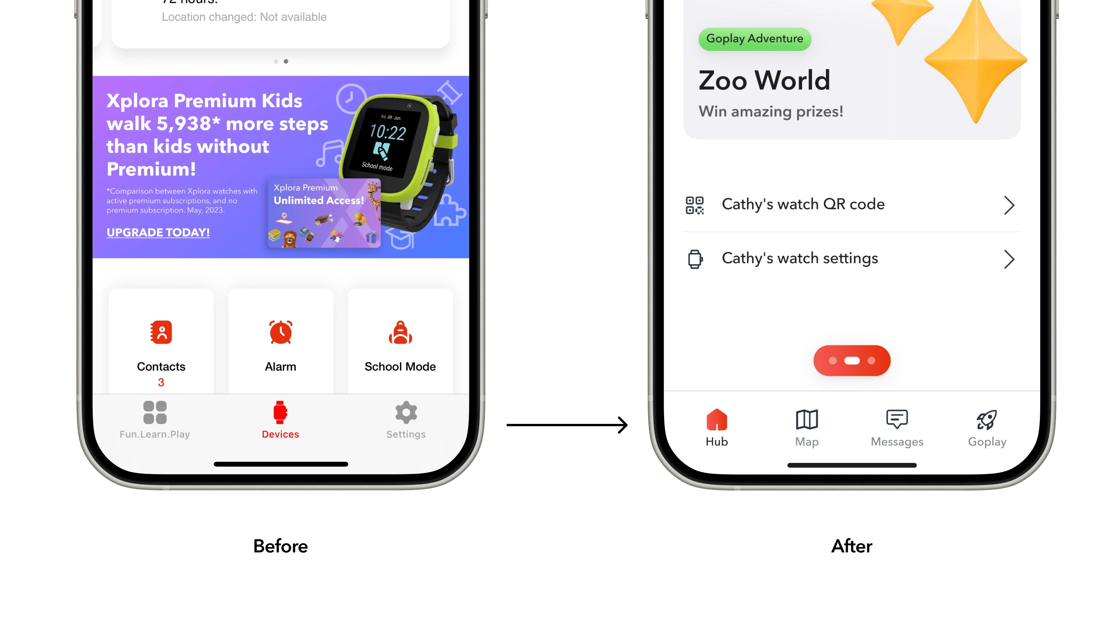
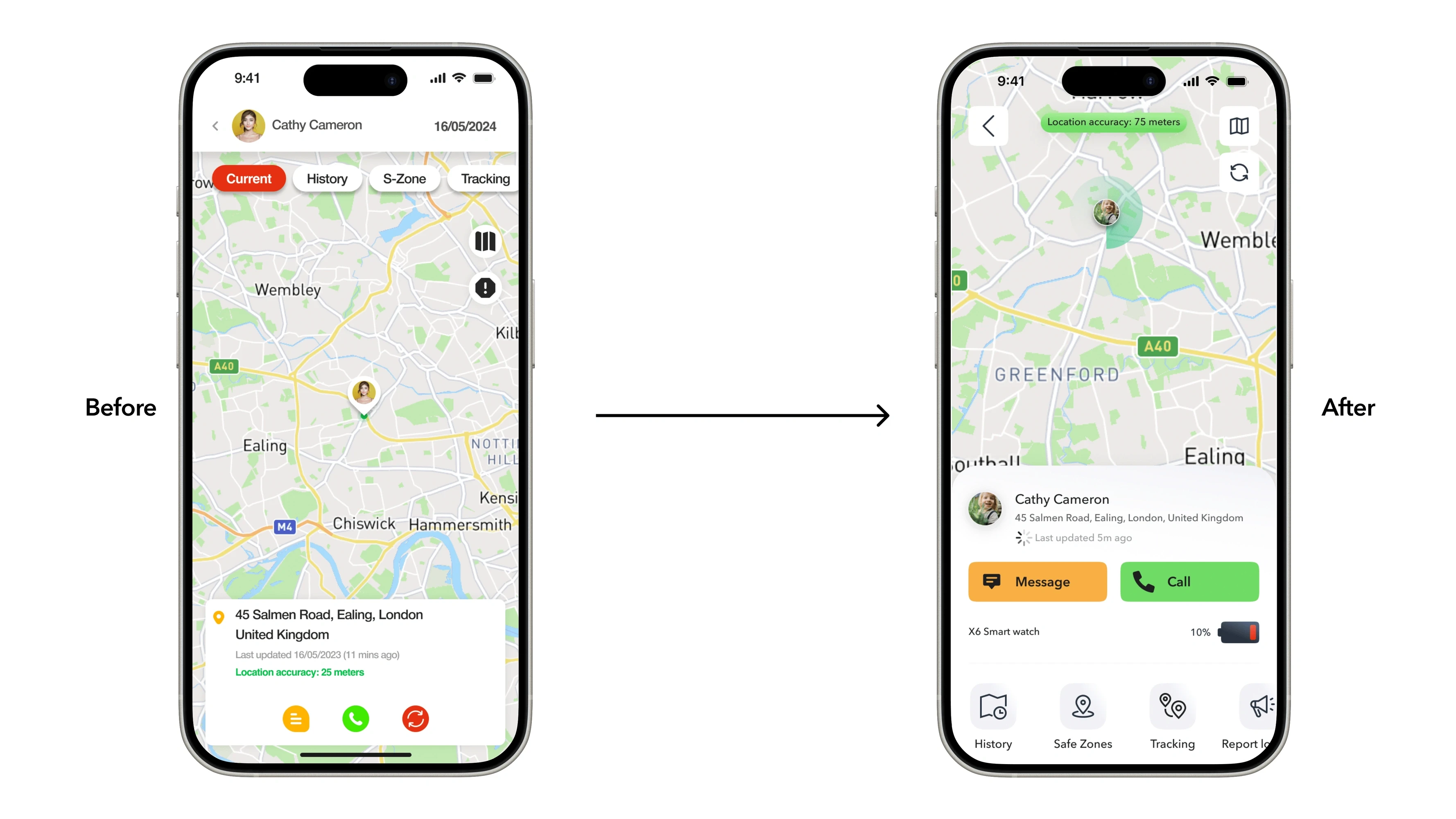
02 — Faster access to everyday actions: I simplified journeys around high-frequency features such as location and messaging, introducing more direct, one-tap access.
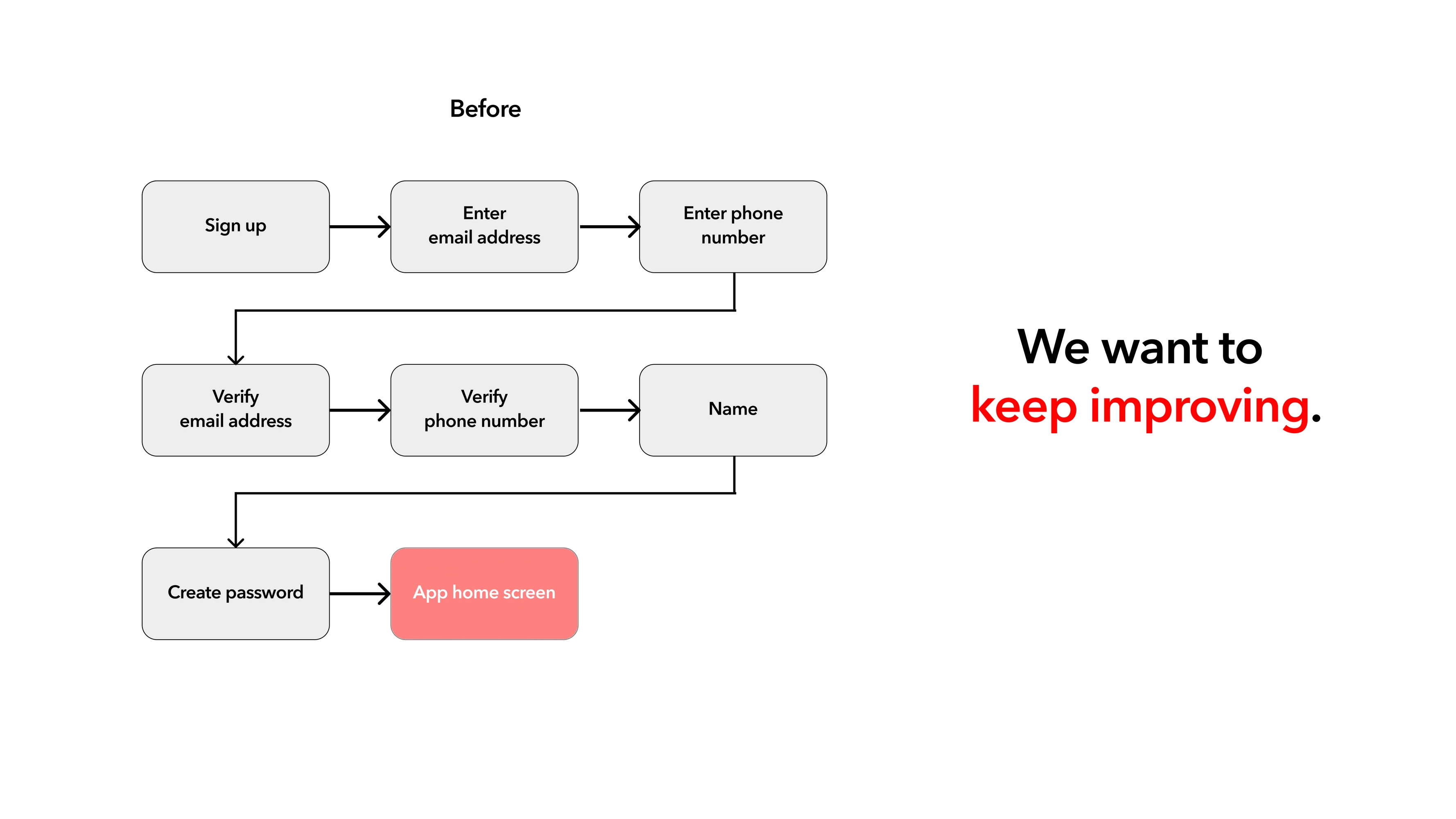
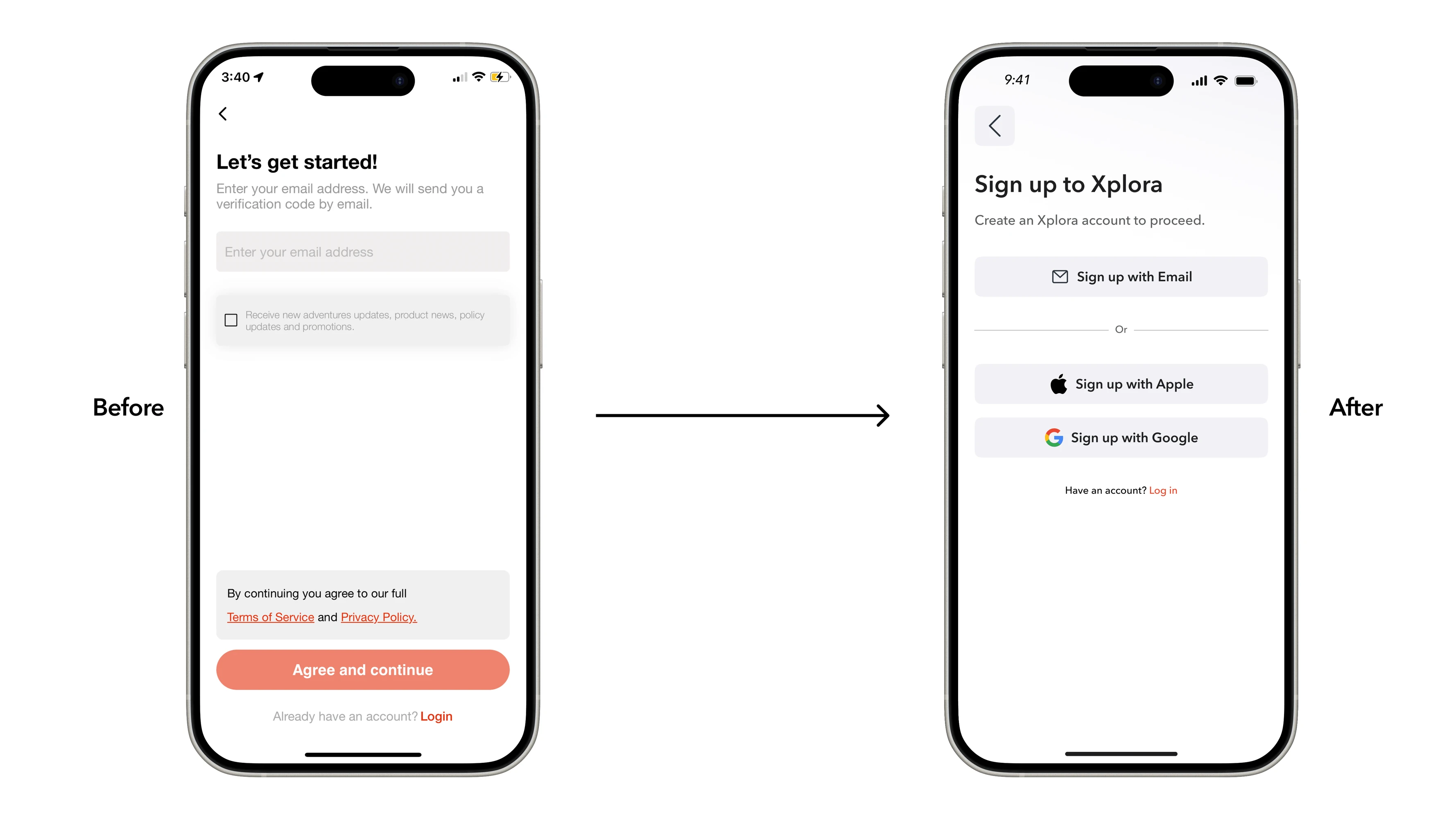
03 — Lower-friction onboarding: Behavioural data showed significant friction during activation. I simplified account creation and introduced SSO and biometric login.
04 — A consistent product language: The audit exposed repeated inconsistencies across the app. Working with the UI Designer, we established more consistent visual, interaction and reusable patterns.
05 — Better location & safety: I improved experiences around Location tracking, Low-connection alerts, Safety modes. The objective wasn’t simply showing more information. It was helping parents answer: “Is everything okay?”
Dev handoff
App v3 contained many interconnected journeys, handled by just two designers. Rather than finishing the entire redesign before development started, I proposed a modular workflow:
UX → UI → Review → Development → QA
While one section moved into development, design on the next could continue.
This enabled:
01 — Parallel delivery
02— Earlier feedback
03 — Better workload management
04 — More focused QA
05 — Fewer bottlenecks
We changed how we designed the product so we could change the product faster.


Achievements
65% ↓
Onboarding drop-off
40% ↑
Feature engagement
30%
App v3 adoption
+22% YoY
Account growth
Beyond the metrics, Xplora gained a product foundation organised around families instead of a single child-device relationship, making it better suited for new audiences, products and services.


Learnings
This project showed that scaling a product is not just a UI problem — it is a product-model and delivery-model problem.
By changing both, we solved the immediate usability issues while creating a structure that was easier to extend as Xplora added new users, devices and services.
That became the principle behind the work: Solve the structure first. Then optimise the experience built on top of it.
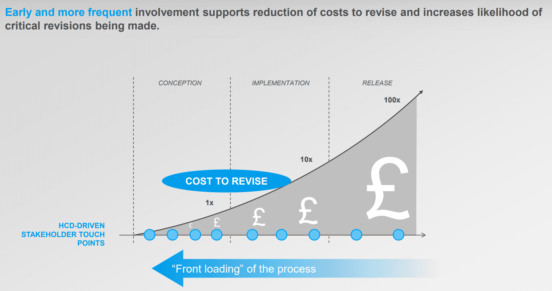
Also the stakeholders were involved too late. Instead, they should be involved early and more frequently.

Keep exploring

