What makes it worth reading
How I helped turn a growing collection of inconsistent interfaces into a shared system used by Design and Engineering to build faster and more consistently.
Impact
25% ↑ design & development efficiency.
Reduced repeated design decisions.
Stronger consistency across the product

Role
Senior Product Designer
Team
Year
2024
As more features and experiences were added, inconsistencies accumulated across the platform. The same types of elements could behave or look differently depending on where they appeared. That created three recurring problems:
01 — Inconsistency: Typography, colour, spacing and UI patterns varied across the product.
02 — Lack of clarity: Some components and interactions were difficult for users to understand.
03 — Repeated effort: Designers and developers were repeatedly solving problems that should already have had an established answer.
The challenge became: How do we give teams enough consistency to move faster without creating a system so rigid that it slows product development down?

Before creating new components, the team conducted a comprehensive audit of the existing product.
We reviewed: UI elements, Components, Typography, Colour, Spacing, Navigation, Interaction patterns.
The audit combined:
01 — Inventory analysis
02 — Pattern identification
03 — Heuristic evaluation
04 — User feedback
Rather than immediately replacing inconsistent UI, I first asked:
01 — What already works?
02 — What needs to change?
03 — What appears repeatedly enough to become a pattern?
That gave me a clearer picture of where standardisation would create the most value.

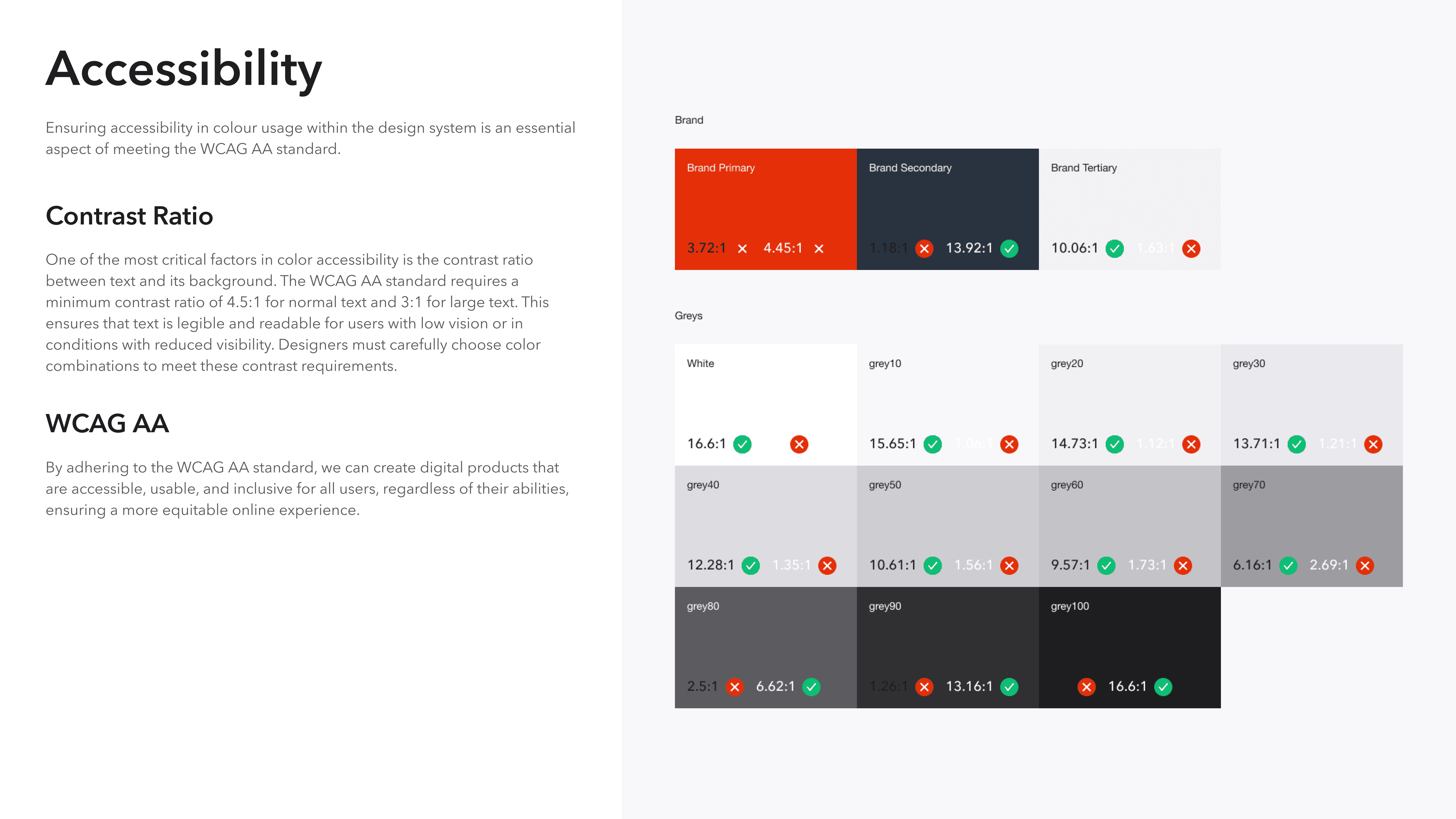
A component library without shared principles would simply recreate the same inconsistencies in a more organised file. So we first established principles around Consistency, Clarity, Efficiency, Accessibility and Flexibility.
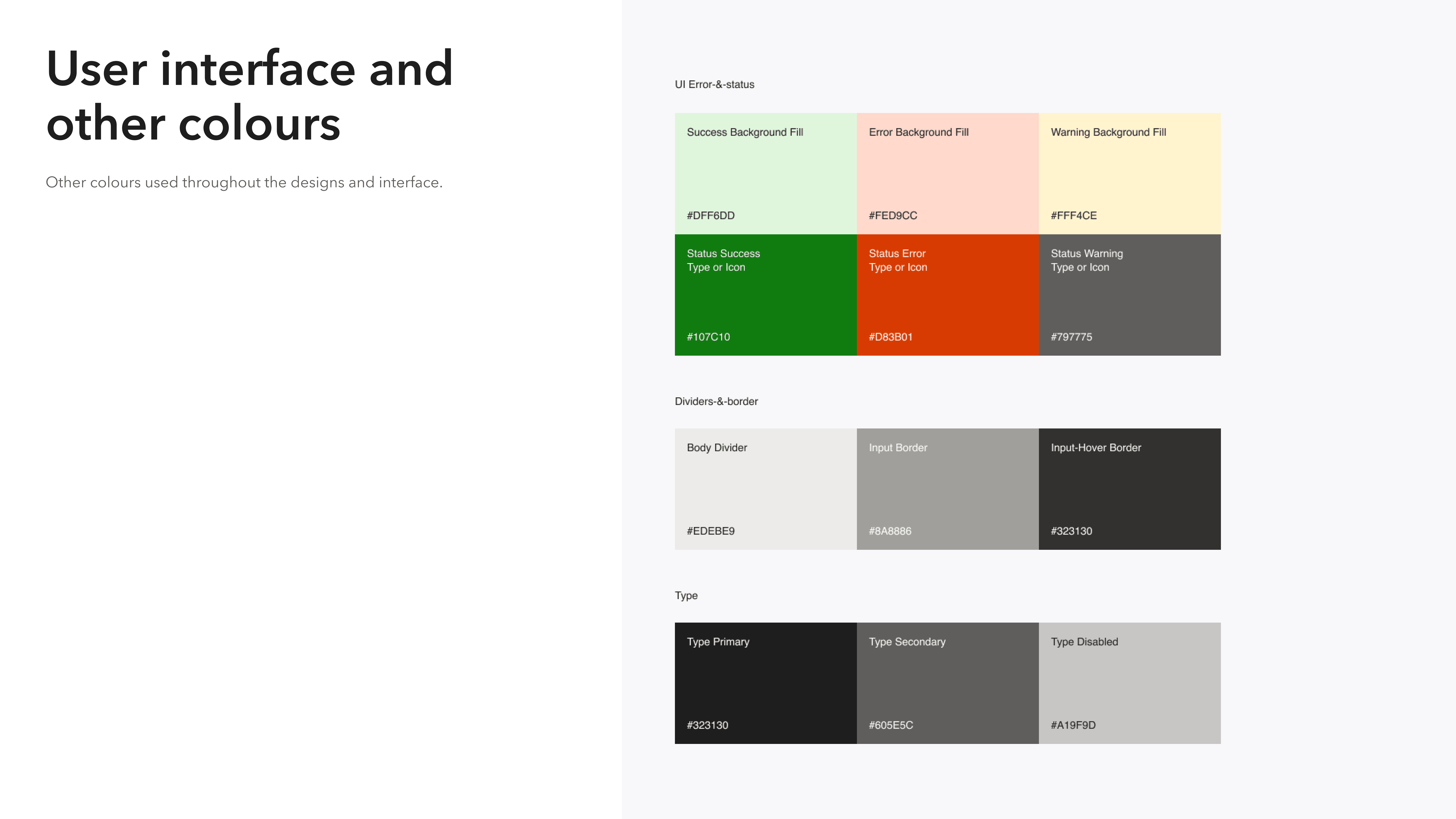
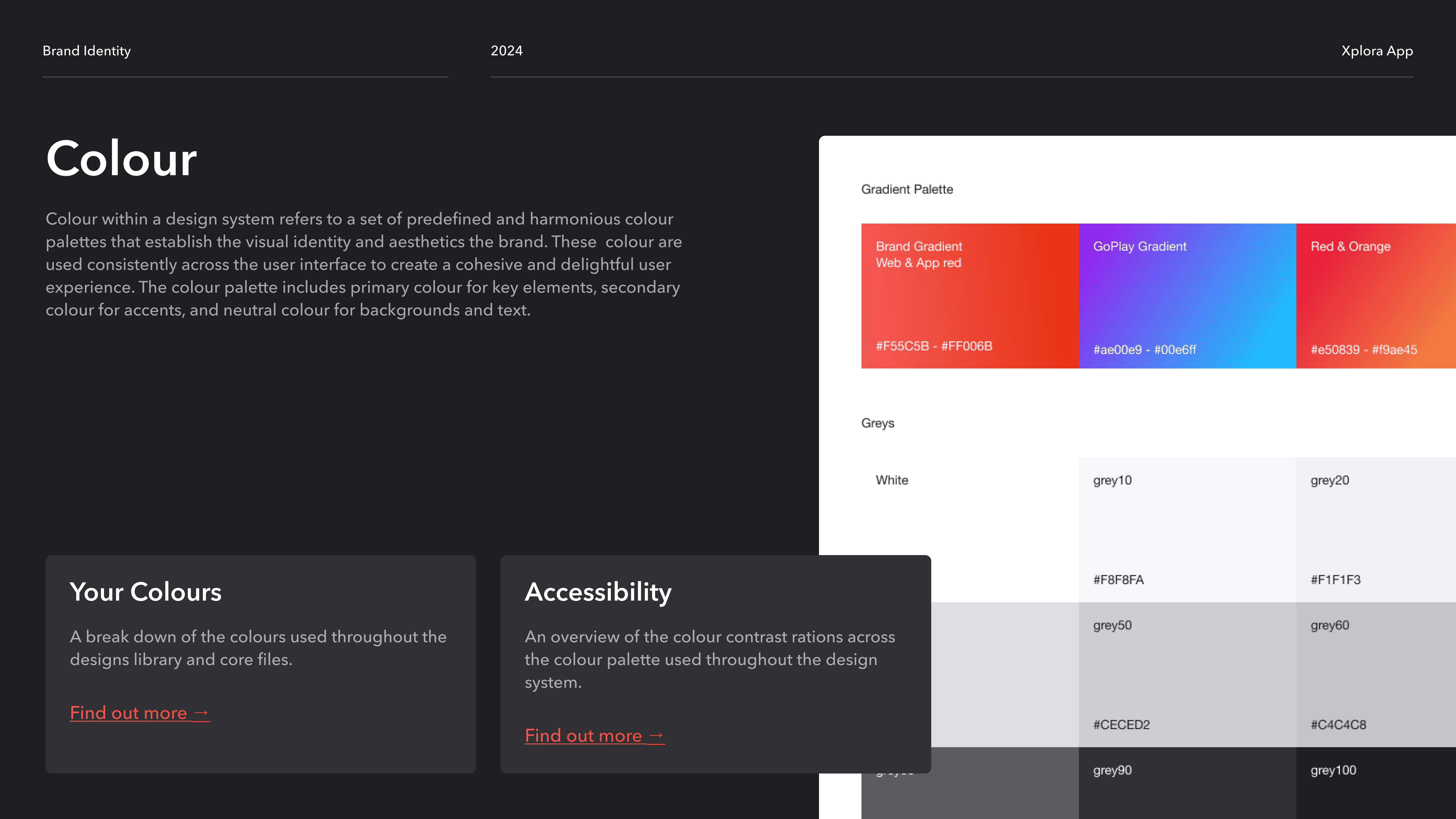
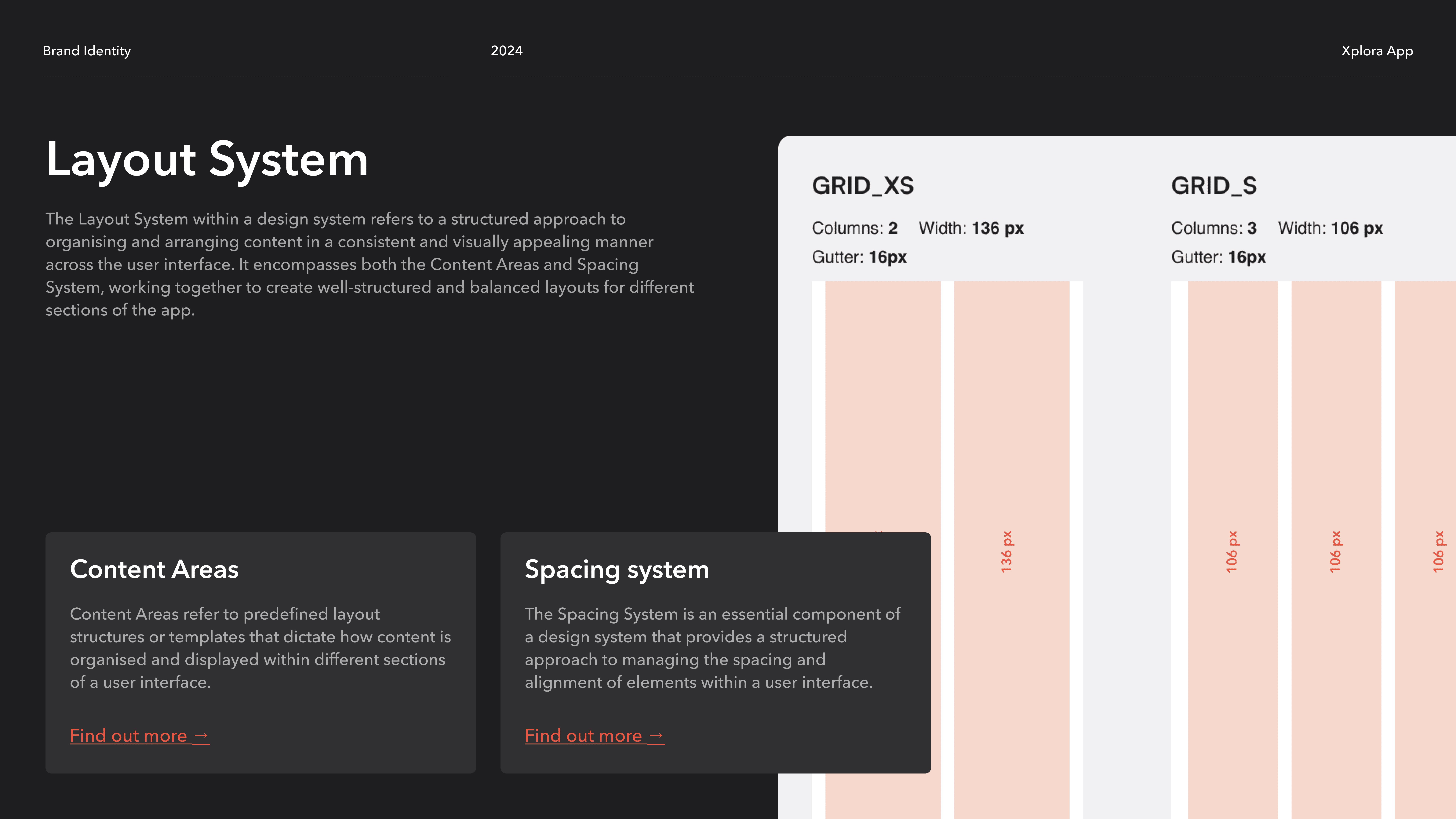
Those principles informed the foundations of the system such as Colour, Typography, Spacing, Grid, Icons, Buttons, Shadows.
Why: teams needed more than reusable UI. They needed a shared set of decisions they could rely on.
The goal was simple: Make the right design decision easier to repeat.





Once the foundations were clear, recurring interface patterns could be turned into components.
The process became:
Inventory → Identify pattern → Design → Validate → Develop → Reuse
Components were designed around established principles rather than individual project requirements.
Why: a Design System creates leverage when teams stop rebuilding the same solutions from scratch.
This gradually created a reusable library that could support new product work while maintaining a more consistent experience.

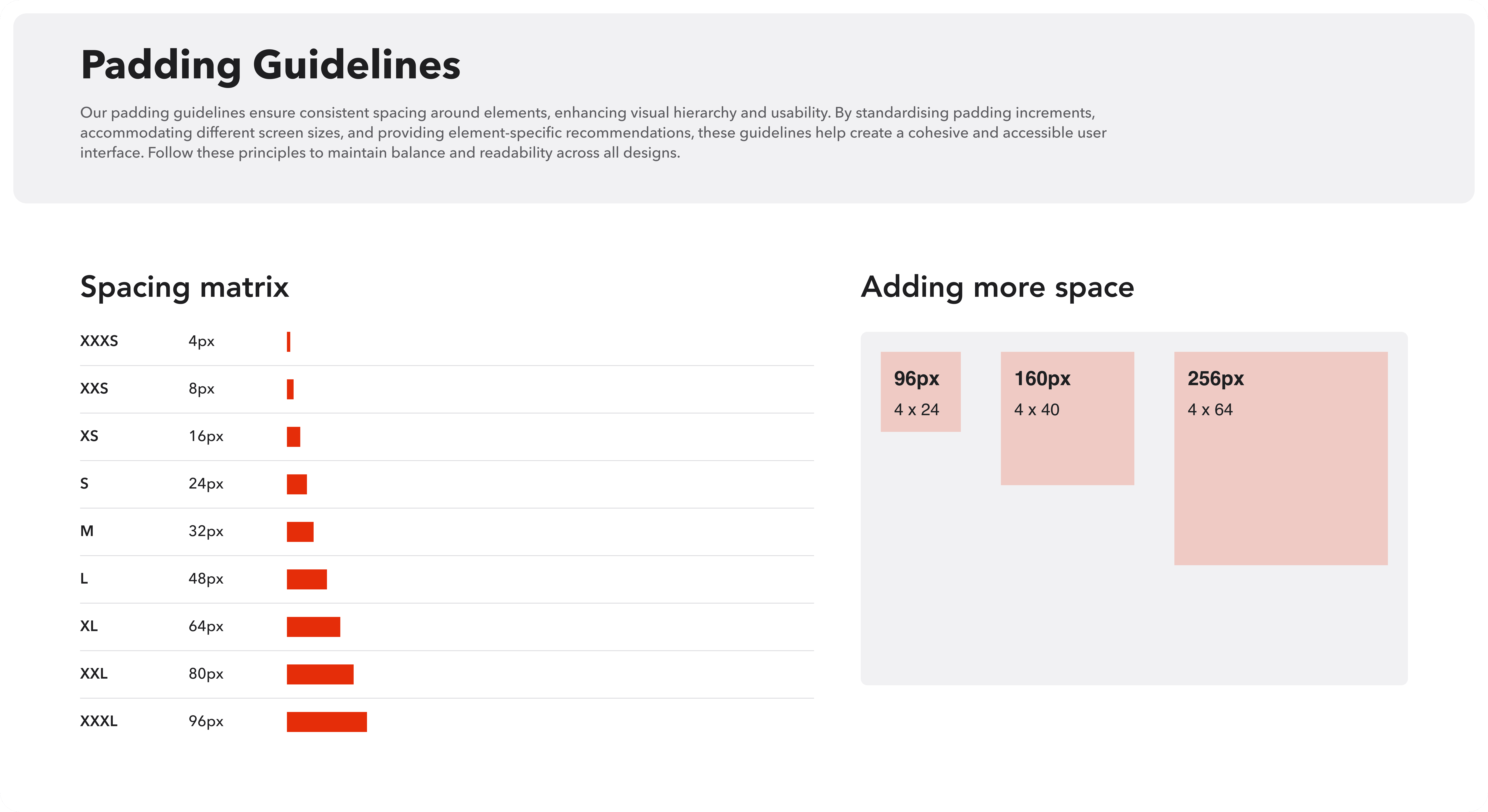


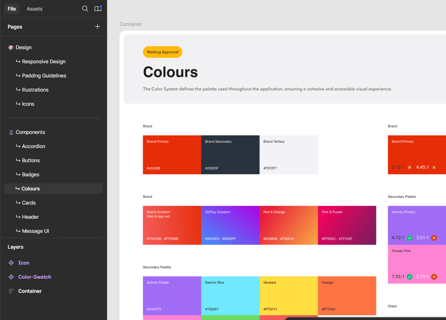

Consistency breaks down quickly if Design and Engineering maintain separate interpretations of the same system. So we established shared design tokens covering areas such as: Colour, Typography, Spacing.
These gave developers access to the same underlying decisions used by designers. I also worked closely with Engineering on the feasibility of more complex components before they became part of the system.
Why: a component that only works in Figma isn’t a Design System component. It has to survive implementation.
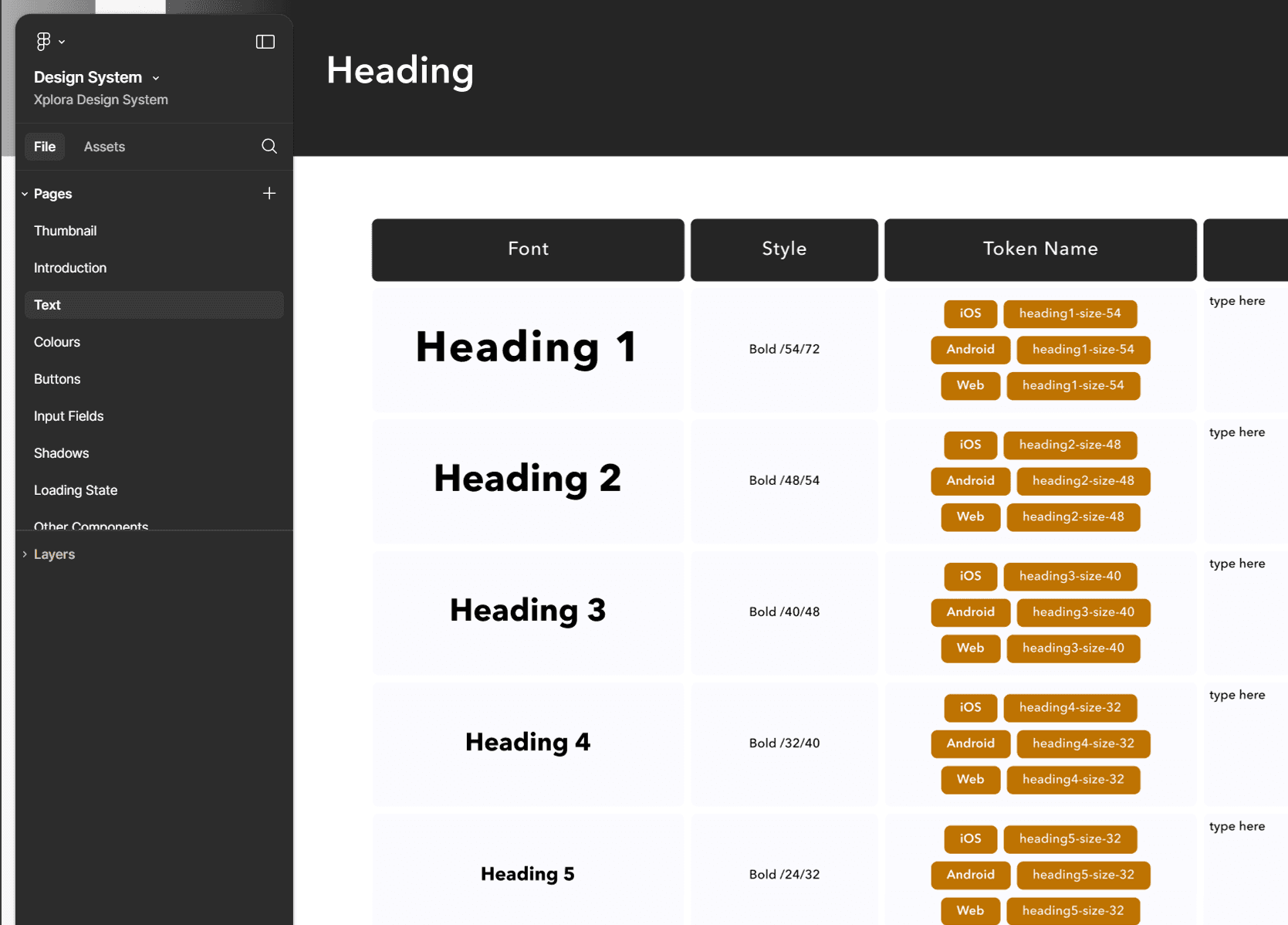
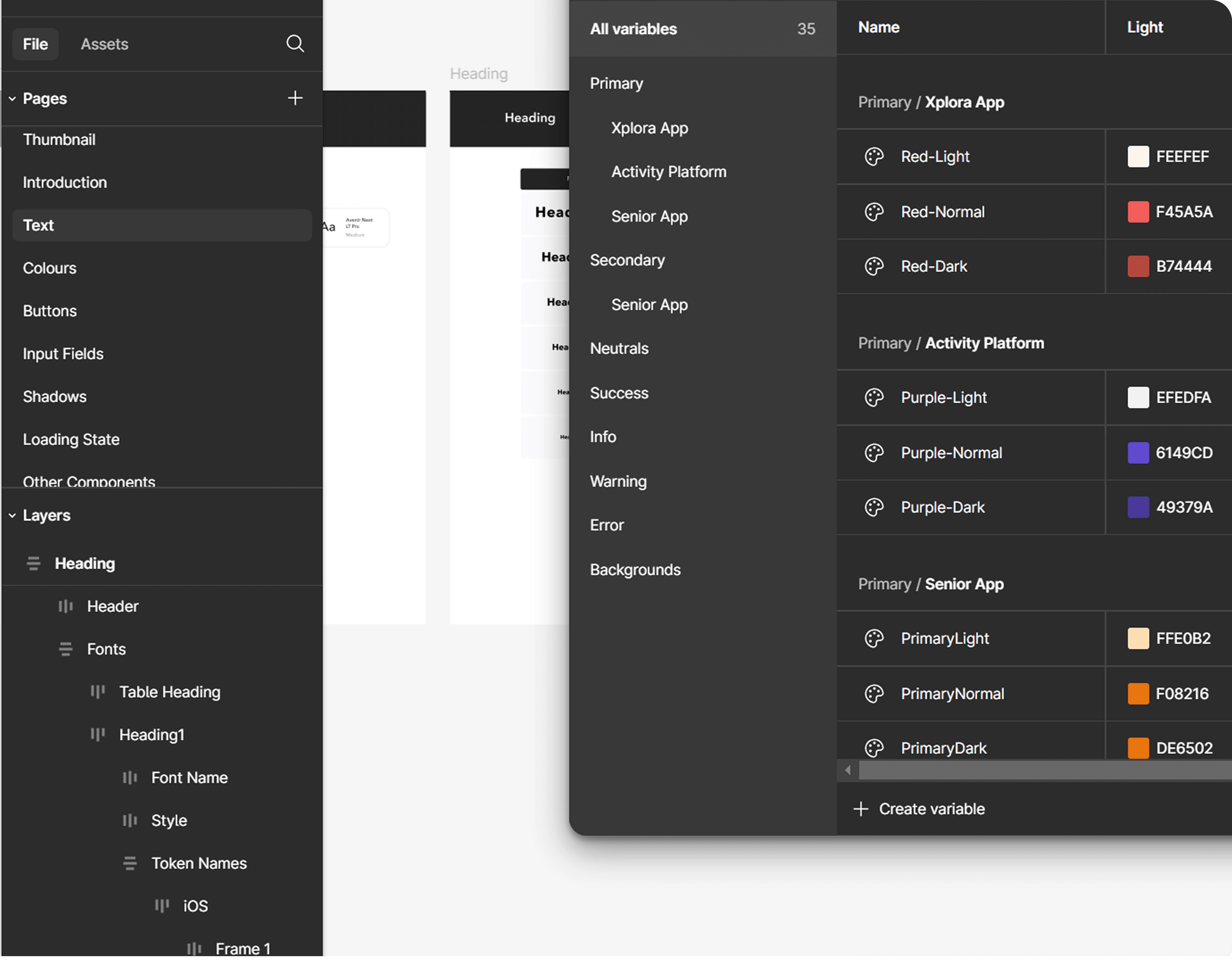
Building the library was only the beginning. Without ownership and governance, a Design System gradually becomes outdated while teams start creating exceptions around it. I took ongoing responsibility for maintaining the system through:
Monthly alignment: I ran monthly discussions with Design, Marketing and Engineering to review:
01 — New components
02 — Existing component updates
03 — Implementation constraints
04 — Upcoming needs
Mentoring: I supported new team members and junior designers in understanding when to reuse, extend or introduce patterns.
Transparent documentation: I maintained a shared timeline of key Design System changes and improvements, visible to Designers, Developers, VP, Platform & Service, CTO. This made the evolution of the system visible rather than allowing changes to happen independently across teams.
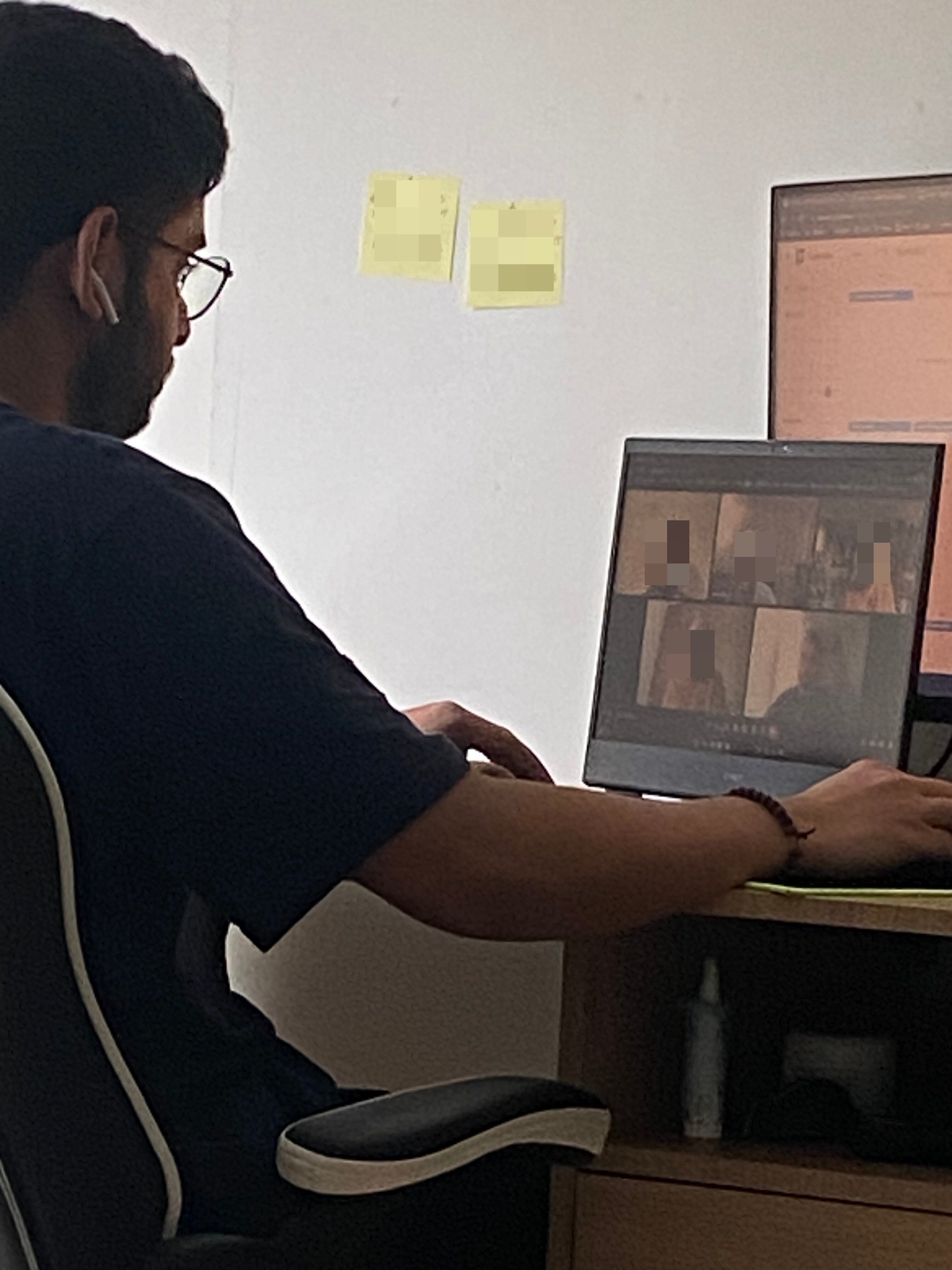

The Design System created a shared foundation across Design and Engineering.
25% ↑
Design & development efficiency
It also reduced repeated decision-making and gave teams reusable foundations for:
01 — Visual consistency
02 — Component behaviour
03 — Faster design
04 — More predictable implementation
The biggest improvement wasn’t simply having more components. It was reducing the number of problems teams had to solve from scratch.
A Design System is not a Figma library. Its value comes from the operating model around it — shared principles, reusable foundations, engineering alignment, clear ownership and continuous governance.
The system became useful because it wasn’t treated as a finished project. It became part of how the organisation designed and built products.
Standardise what should be repeatable, so teams can spend more time solving what isn’t.
Keep exploring

