What makes it worth reading
How I turned scattered customer feedback into a repeatable system for finding product friction, prioritising what mattered and measuring whether it improved.
Impact
App rating 3.8 → 4.2 in 8 months
Android priority complaints ↓ 42–69%
iOS delayed-update mentions ↓ 92%

Customer feedback existed everywhere — App Store reviews, Amazon, Customer Support and internal teams. The problem wasn’t getting more feedback.
It was knowing: What matters most? What should we fix first? And is it actually getting better?
As Head of Service Design, I initiated and led a bi-weekly customer insight process that brought those signals together, identified recurring friction, converted it into product priorities and measured the same issues over time.
Role
Head of Service Design
Data from
Team
Year
2026
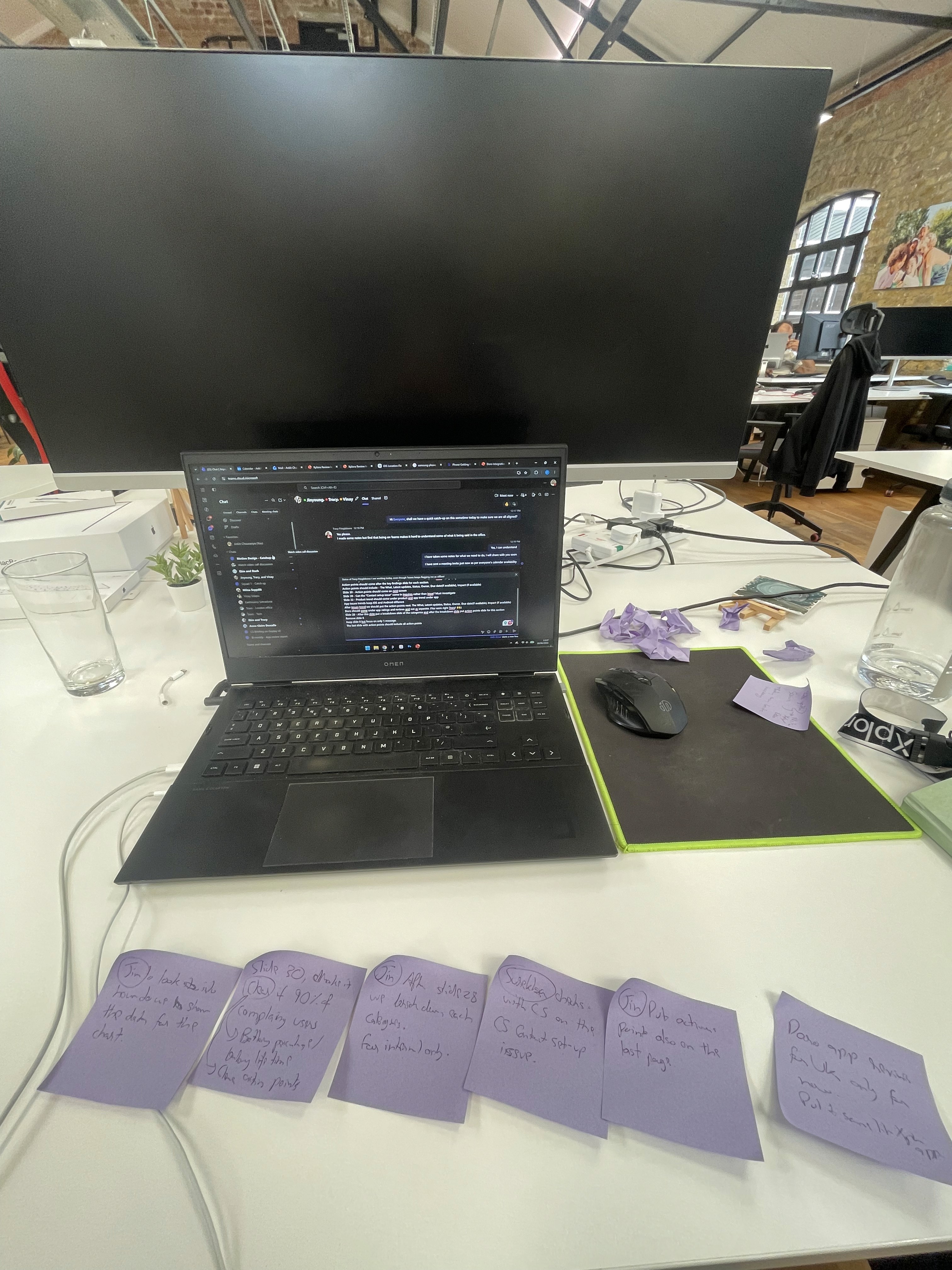
Different teams were seeing different parts of the customer experience.
App reviews highlighted product and reliability issues. Customer Support saw recurring questions and areas users struggled to understand. Amazon surfaced hardware, subscription and service friction.
The wider reporting process covered app reviews, Amazon reviews, customer tickets, returns and action tracking — but those signals needed to become one coherent view of the customer.
Without that shared view, the loudest complaint could easily become more influential than the most persistent problem.
The challenge became: How do we turn disconnected customer signals into priorities the organisation can actually act on?

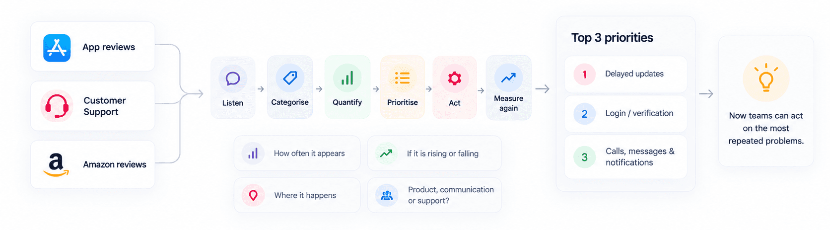
I created a recurring process that brought the main feedback sources together rather than analysing each independently.
01 — App Store reviews revealed product, reliability and usability friction.
02 — Customer Support showed where customers repeatedly needed help.
03 — Amazon reviews surfaced hardware, service and subscription problems.
Competitor reviews helped show whether a problem was specific to our experience or common across the category. Why: one source rarely tells the whole story.
A review might describe the symptom. A support ticket might reveal why it happened. Repeated patterns across channels showed where attention was needed most.


Collecting everything would only create another dashboard. So recurring feedback was filtered into top 3 most common issues as top 3 priorities and everything else was removed until they came under the top 3:
Listen → Categorise → Quantify → Prioritise → Act → Measure again
This made it possible to understand:
01 — How often an issue appeared
02 — Whether it was increasing or decreasing
03 — Where it occurred
04 — Whether the root problem was product, communication or support
The conversation shifted from: “Customers seem unhappy with this.” to: “This is one of the problems appearing repeatedly, and here is how it is changing over time.”


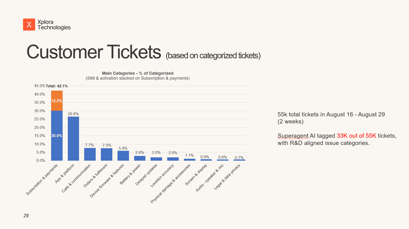
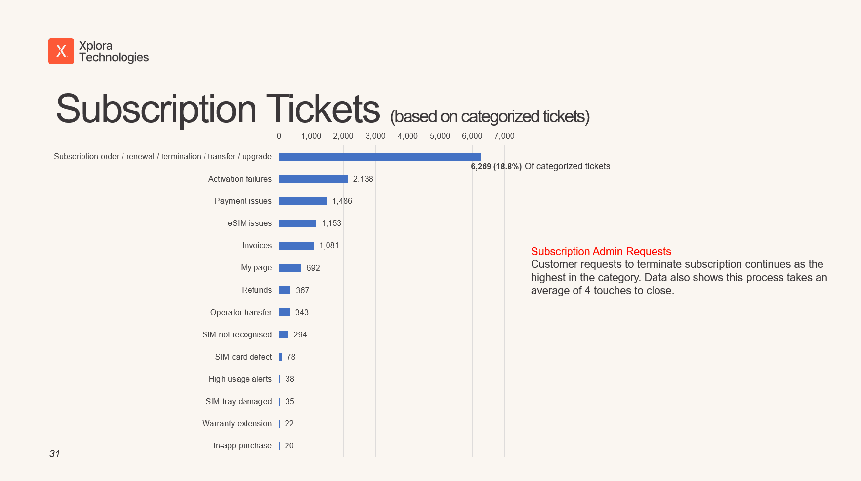
One of the most important parts of the process was not taking every request literally. Customer Support analysis, for example, showed a significant concentration of UI/UX questions around guardian and contact management, particularly adding a second guardian and managing whitelist contacts. At first glance, that could look like a feature problem. But the deeper issue was:
The functionality existed. Customers didn’t understand how to use it.
That changes the solution.
Instead of automatically building something new, we could improve the communication and guidance around the existing experience.
The goal was not to collect feature requests. It was to understand the friction behind them.

The process was designed so research didn’t stop at a presentation. Every priority needed to connect:
Problem → Action → Owner → Status → Expected impact
The guardian/contact insight led to prioritising clearer in-app guidance for whitelist contacts. Another recurring problem involved location behaviour during poor network conditions. I proposed communicating uncertainty more clearly rather than presenting users with a misleading level of precision. Those actions were then tracked alongside ownership, status and intended impact.
A dashboard doesn’t improve a product. Decisions do.


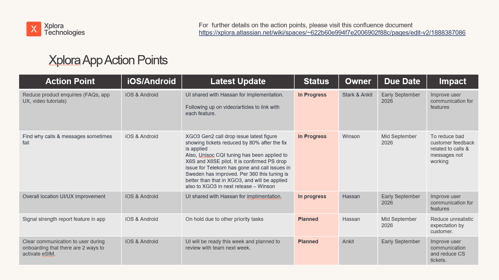

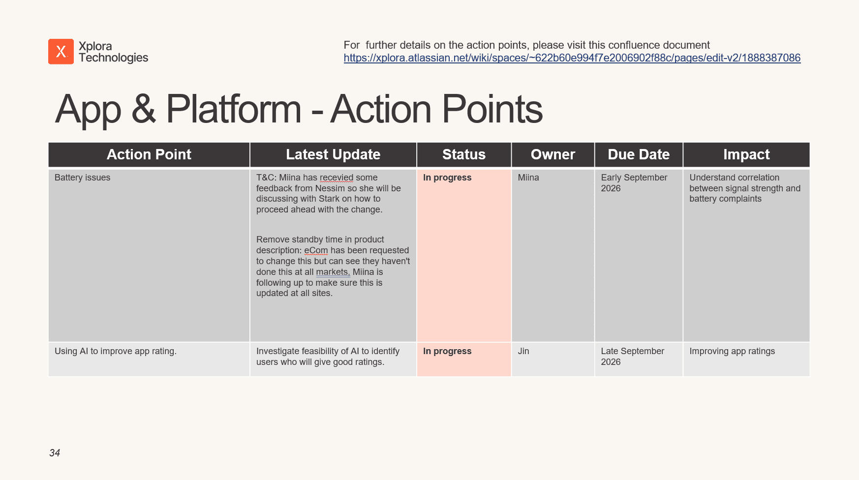
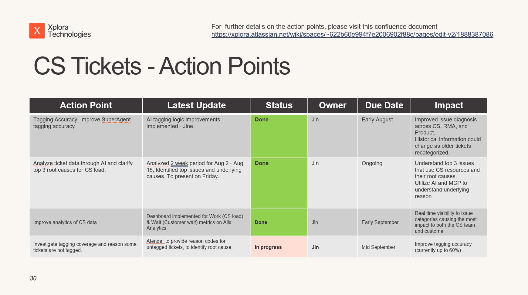
Getting an issue onto the roadmap wasn’t the end. The same categories were reviewed again in later cycles to understand whether they were Improving, Stable, Getting worse, Being replaced by another priority.
The complete loop became: Signal → Priority → Action → Measure → Repeat
That transformed customer feedback from occasional research into a continuous product-improvement system. It also gave Product, Engineering, Customer Support and leadership a shared reference point for deciding what deserved attention next.


From April to July 2026 (4 months), several priority issues being tracked showed substantial reductions.
Android
61% ↓ Delayed updates
69% ↓ Login, registration, verification & forced logout
42% ↓ Calls, messages & notifications
iOS
92% ↓ Delayed-update mentions
And across 8 months: 3.8 → 4.2 App rating.
The bigger shift was organisational. Customer feedback became a repeatable input into product prioritisation — with clearer ownership, measurable follow-through and visibility into whether the problems teams were working on were actually improving.

Most product teams don’t have a shortage of customer feedback. They have a problem turning that feedback into decisions. The biggest shift was moving from:
“Here’s what customers are saying.” to “Here’s what matters most, what we’re doing about it, who owns it and whether it’s getting better.”
That turned customer feedback from a collection of anecdotes into an operating mechanism for continuous product improvement.
Find the friction. Prioritise what matters. Improve it. Measure again.
Keep exploring

