What makes it worth reading
How I used behavioural observation and quantitative evidence to move from “the website feels difficult” to a clear diagnosis of where the booking experience was failing and what should change.
Impact
SUS 32.1
Credibility 55.54

Air India’s website serves a high-intent journey: helping travellers find information, select flights and move confidently towards booking.
Rather than redesigning the experience from assumptions, I conducted a structured usability study to understand where users were struggling, why those problems occurred, and which issues mattered most.
As the sole Product Designer, I planned and conducted the research across the homepage and flight-selection experience, combining direct observation with quantitative usability measures.
The website contained large amounts of information across a journey where users needed to make decisions quickly and confidently. But simply looking at the interface couldn’t tell me:
01 — Where are people actually getting stuck?
02 — Which problems have the biggest effect on task completion?
03 — Are the issues visual, structural or behavioural?
So instead of beginning with redesign concepts, I started by observing people using the existing product.
The question became: What does user behaviour reveal that an interface review alone cannot?

I chose moderated usability testing because it allowed me to capture both:
What users did and How effectively they could do it
I recruited 6 participants and asked them to complete 7 representative tasks, including common journeys such as finding flights and navigating booking-related information. For each task, I tracked:
01 — Effectiveness
02 — Time on task
03 — Assists required
04 — Errors made
I then combined those observations with:
01 — System Usability Scale (SUS)
02 — Credibility
03 — Emotional perception
04 — Net Promoter Score
Why: Individual comments can be subjective. Combining behaviour with measurable usability signals made it easier to understand both where the experience failed and how serious the problems were.


Across the sessions, several problems repeated.
01 — Users struggled to find important information: Essential content wasn’t always easy to identify, lowering task success.
02 — Tasks took longer than expected: The organisation and navigation forced users to spend more time searching and interpreting the interface.
03 — Errors appeared repeatedly: Participants made frequent mistakes while trying to complete common tasks.
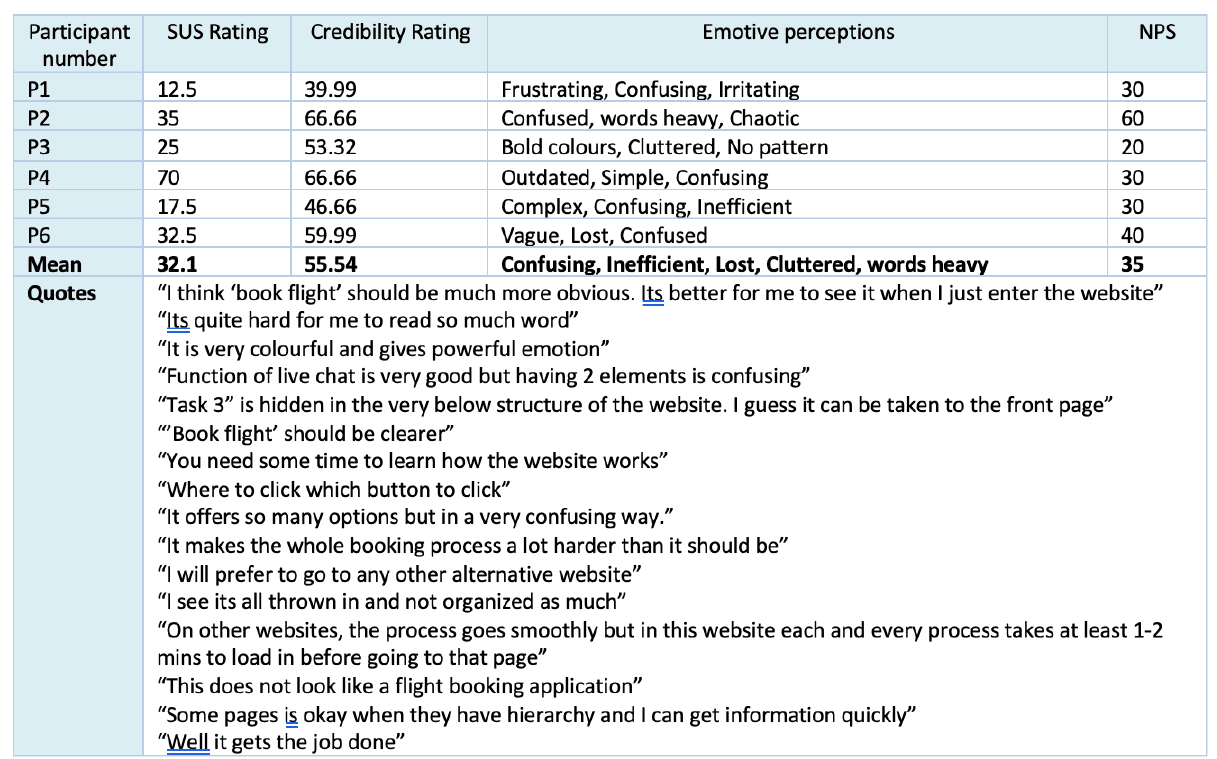
04 — Confidence was low: Users described the experience as Confusing, Inefficient, Cluttered.
These weren’t isolated usability problems. They pointed towards deeper issues in how information and actions were structured.


The qualitative observations were reinforced by the usability measures.
32.1
System Usability Scale
55.54
Credibility score
35
Net Promoter Score
The SUS score in particular showed that the experience had substantial usability problems. The numbers didn’t replace what I observed. They helped quantify the severity of what users were already showing through their behaviour.


Reviewing the sessions revealed five recurring causes behind the difficulties.
01 — Information overload: Too much content competed for attention, making it difficult to understand what mattered first.
02 — Poor information architecture: Navigation and content organisation didn’t consistently match users’ expectations.
03 — Inconsistent visual design: Different patterns across the experience reduced predictability and made the product feel fragmented.
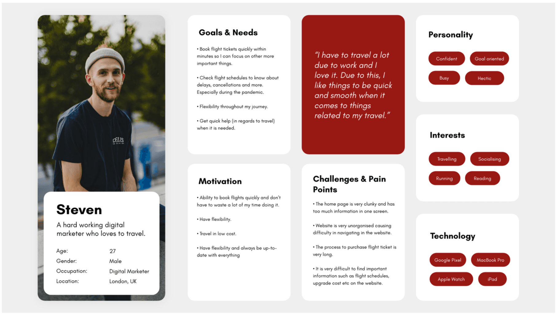
04 — Limited mobile optimisation: The experience did not translate effectively to smaller screens.
05 — Weak calls to action: Important next steps were not always visually clear enough to guide users confidently.
This gave me a much more useful output than simply: “The website needs a redesign.” It showed what needed to change and why.


The recommendations followed directly from the behaviours observed during testing.
01 — Simplify the information hierarchy: Reduce competing content and use clearer hierarchy so users can identify important information faster.
02 — Restructure navigation: Create an information architecture that better matches how users expect to move through flight-related tasks.
03 — Establish visual consistency: Use consistent typography, colour, spacing and interaction patterns to make the journey more predictable.
04 — Strengthen calls to action: Make primary actions easier to identify so users understand what to do next.
05 — Improve accessibility and mobile behaviour: Design the experience to remain usable across devices and accommodate a wider range of users.
The goal wasn’t to redesign everything. It was to prioritise the changes most directly connected to observed user difficulty.


The study produced an evidence-backed diagnosis of the booking experience rather than a redesign based on personal judgement.
It identified:
01 — Where users struggled
02 — How those problems affected task completion
03 — Which structural issues were causing them
04 — What should be prioritised in a redesign
Because the work focused on research and recommendations, I would not claim a post-redesign performance improvement without implementation data.
The value of the project was turning unclear usability concerns into specific, measurable and actionable design priorities.

The most useful research doesn’t end with a list of usability problems. It changes what gets prioritised next.
By combining observed behaviour with task performance and usability measures, I could separate subjective reactions from repeated product problems and connect those problems to concrete design decisions.
The next stage of validation could extend the evidence through contextual inquiry, controlled A/B testing and eye-tracking studies.
Don’t redesign what looks wrong. Find evidence of what is actually getting in the user’s way.
One important change from your old case study: I have not described NPS 35 as “negative.” I’d show the number without that interpretation; the much stronger evidence here is the 32.1 SUS score plus the observed task failures and user perceptions.
Keep exploring

