What makes it worth reading
How I designed a complete product user journey for two user demographics with naturally conflicting needs — teenage independence and parental safety.
Impact
Simplified 10 purchase scenarios across 4 sales channels.
Designed the end-to-end parent + teen safety experience.
Unified delivery across 2 companies and 3 countries.

Project Overview
Giving a teenager their first smartphone creates a difficult product tension.
Teens want independence, flexibility and a phone that feels like their own. Parents want confidence that the device is safe and manageable.
The product was a dedicated teen smartphone developed in collaboration with HMD and Samsung, with parental controls integrated deeply into the device rather than added as a separate layer.
As Senior Product Designer, I led the UX/UI across the ecosystem — from purchase and activation to onboarding, parental controls and the teen-side experience — working with teams across London, China and Korea.
Role
Senior Product Designer
Team
Year
2025
Teenagers needed a smartphone that felt capable, personal and independent. Parents needed something safe, manageable and trustworthy. The controls also had to work deeply across the phone experience and be reliable enough for parents to trust.
So the core question became: How do we create a smartphone teens actually want to use, while giving parents controls they can genuinely rely on?
Everything from purchase and activation to onboarding, restrictions and daily use had to support that balance.


This wasn’t a single-app design problem. A family could buy the phone through Webshop, Retail, Amazon, Telco.
Each route could involve different combinations of Device, SIM, Subscription, Activation, Parental-control service.
Those combinations changed what happened after purchase. Before designing UI, I mapped the experience across:
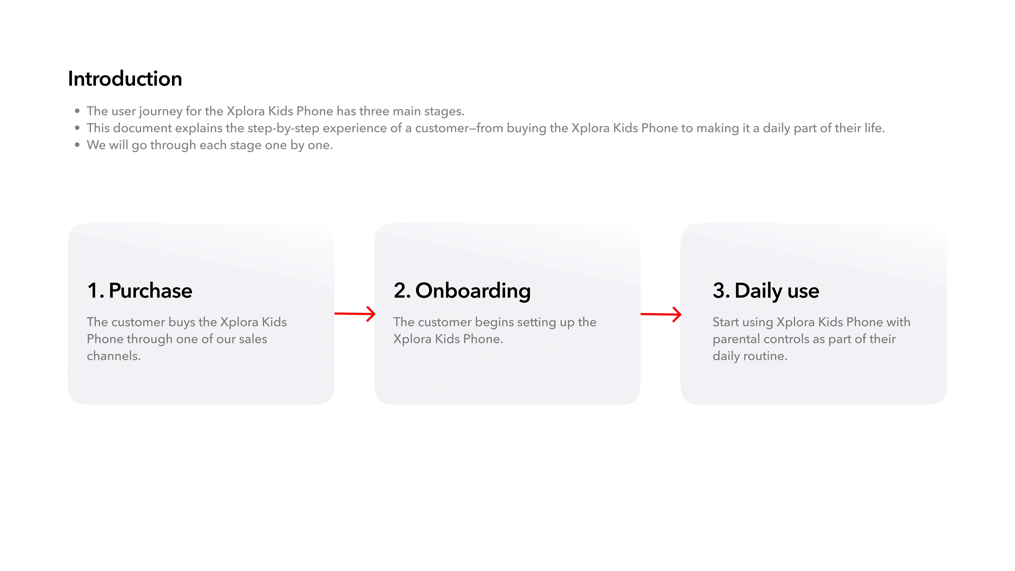
Purchase → Onboarding → Daily use
Together with Product, Engineering and partner teams, I mapped 10 purchase scenarios and the dependencies behind each one.
Why: if each channel, subscription and service was designed separately, the customer would inherit the complexity.
The principle became: Keep the complexity in the system, not in the user’s head.
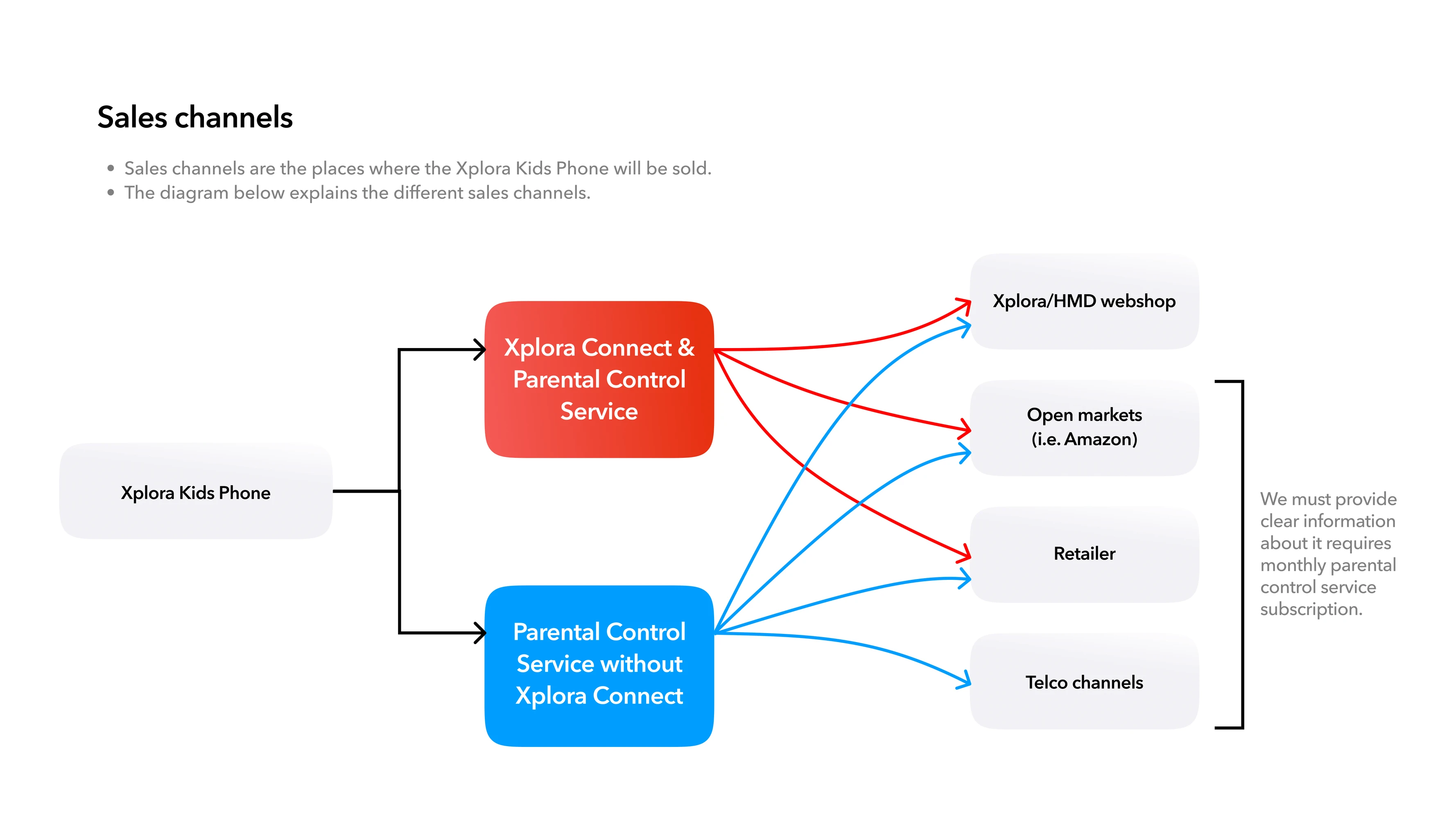
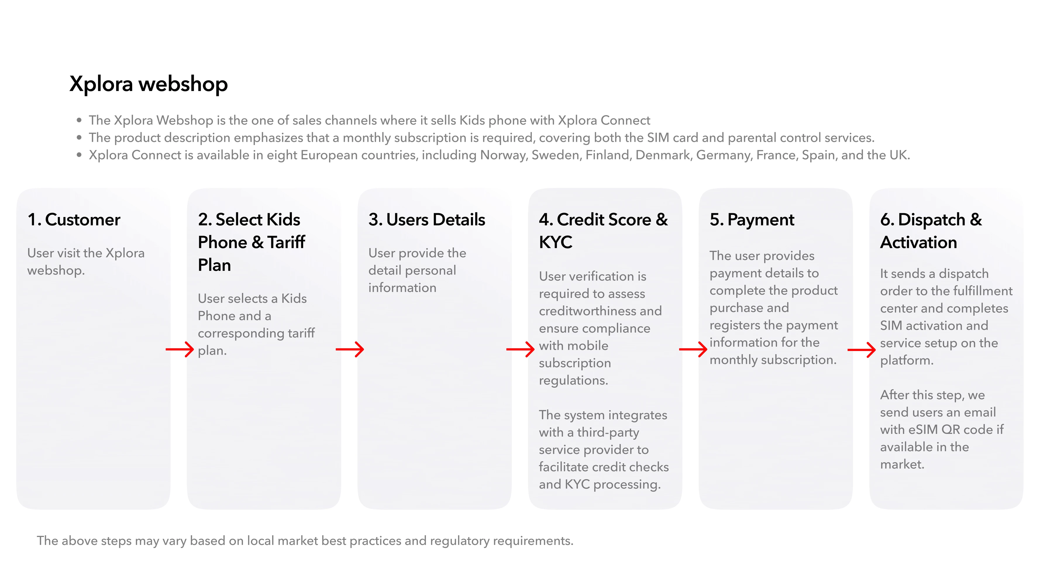
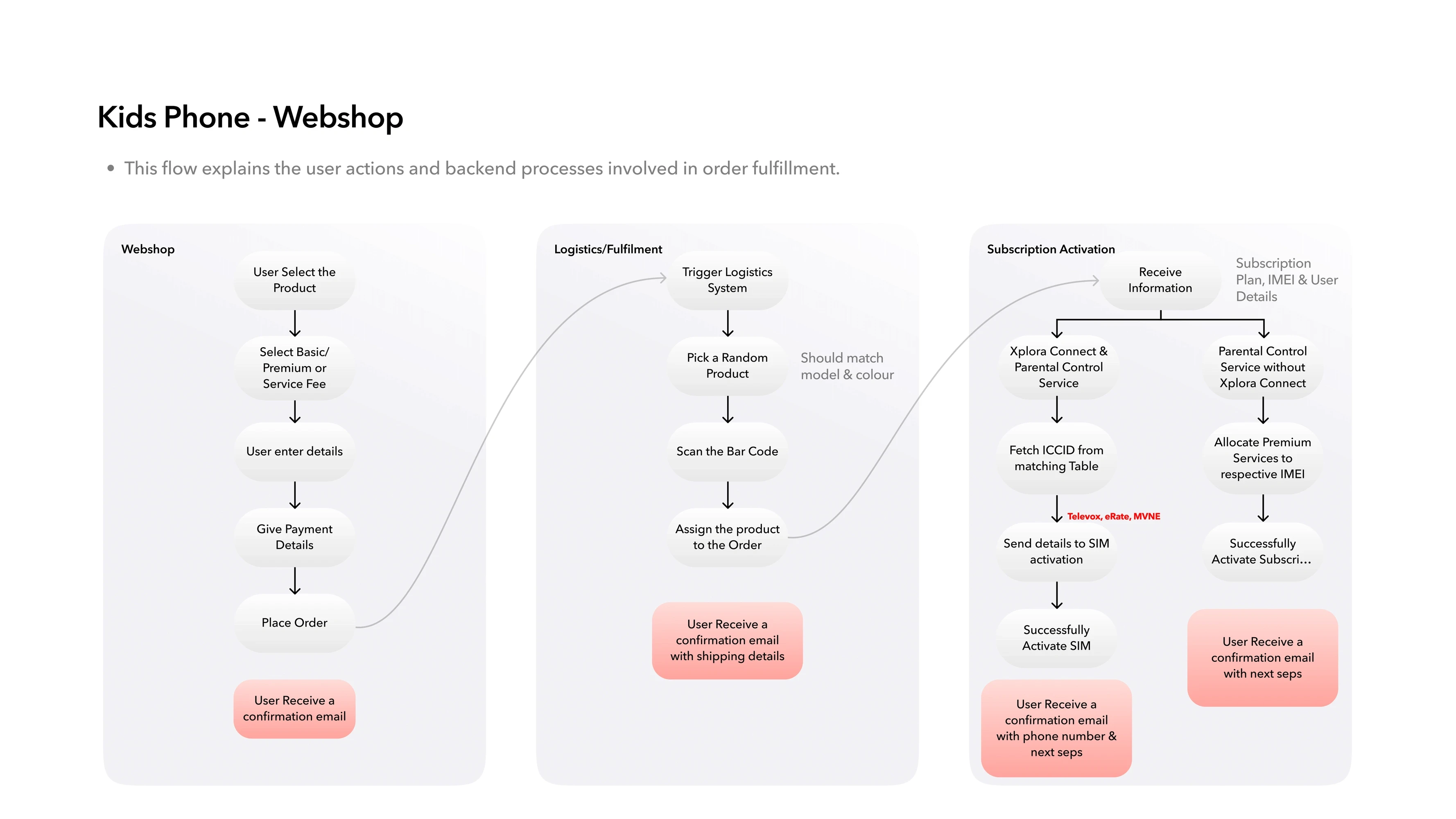
The same phone could reach a family through very different routes. For each scenario, I mapped:
Product selection → Customer information → Payment → Fulfilment → Activation → Parent setup
I also designed the communication needed between purchase and activation so families understood what to do next.
Why: buying through Amazon, retail or a telco shouldn’t create completely different setup experiences for the same product.
The underlying systems could vary. The customer journey still needed to feel coherent.
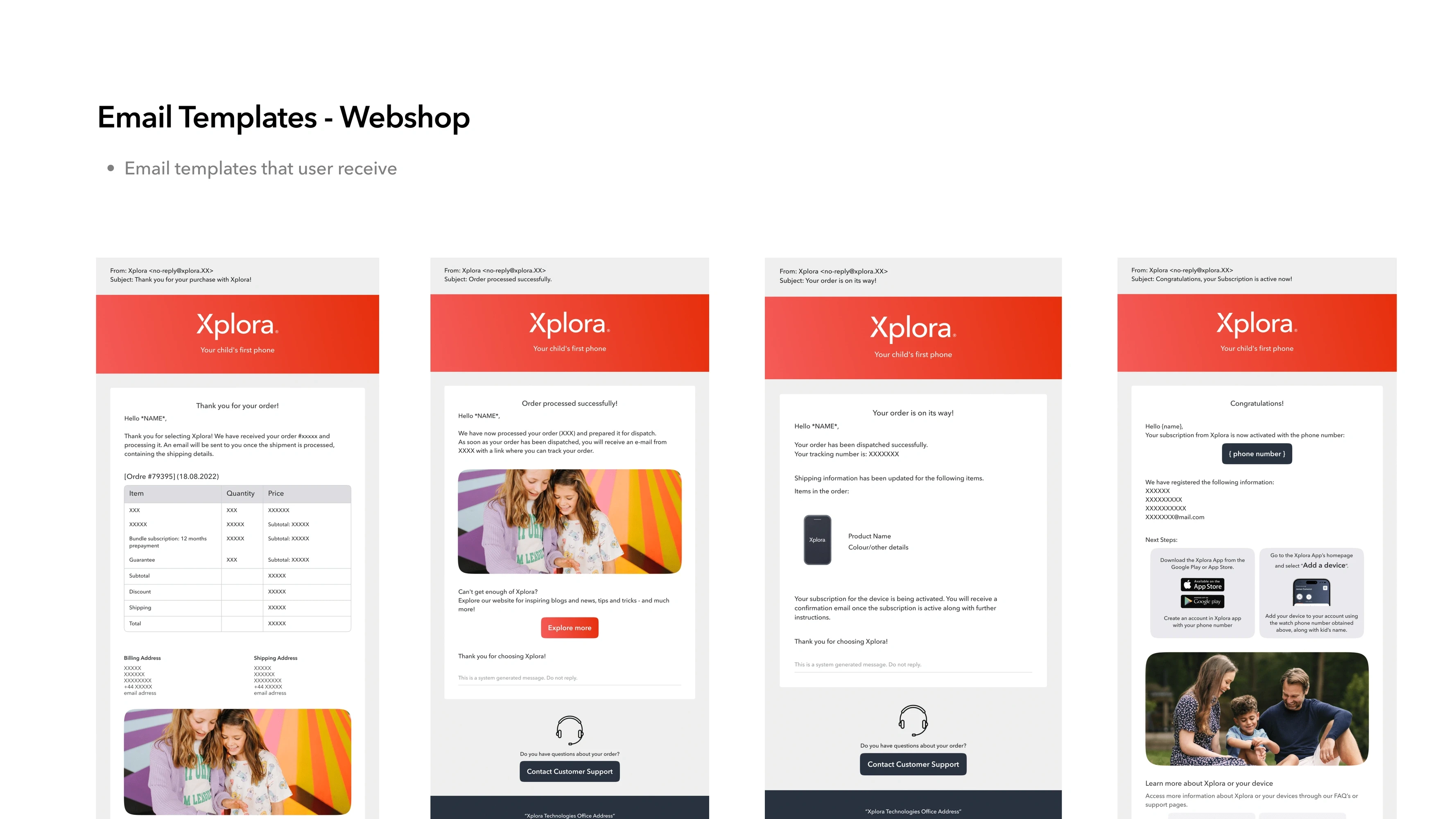
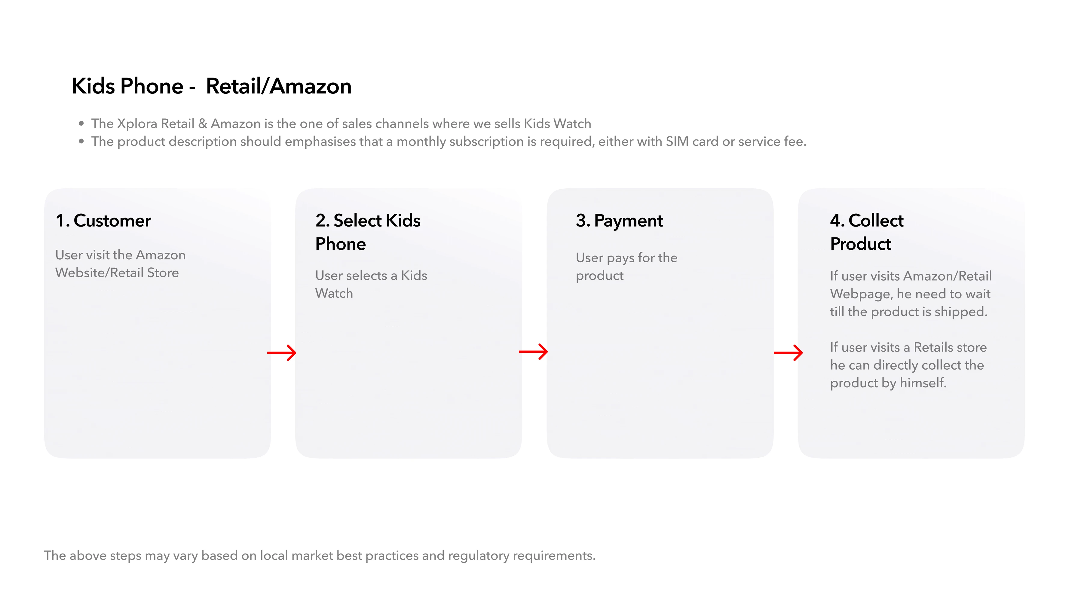
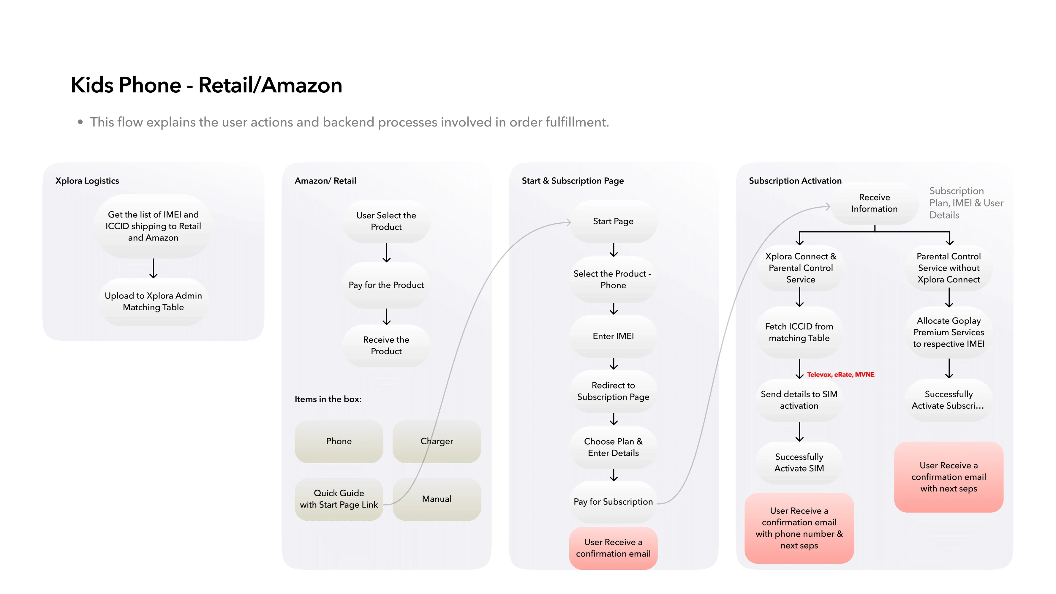
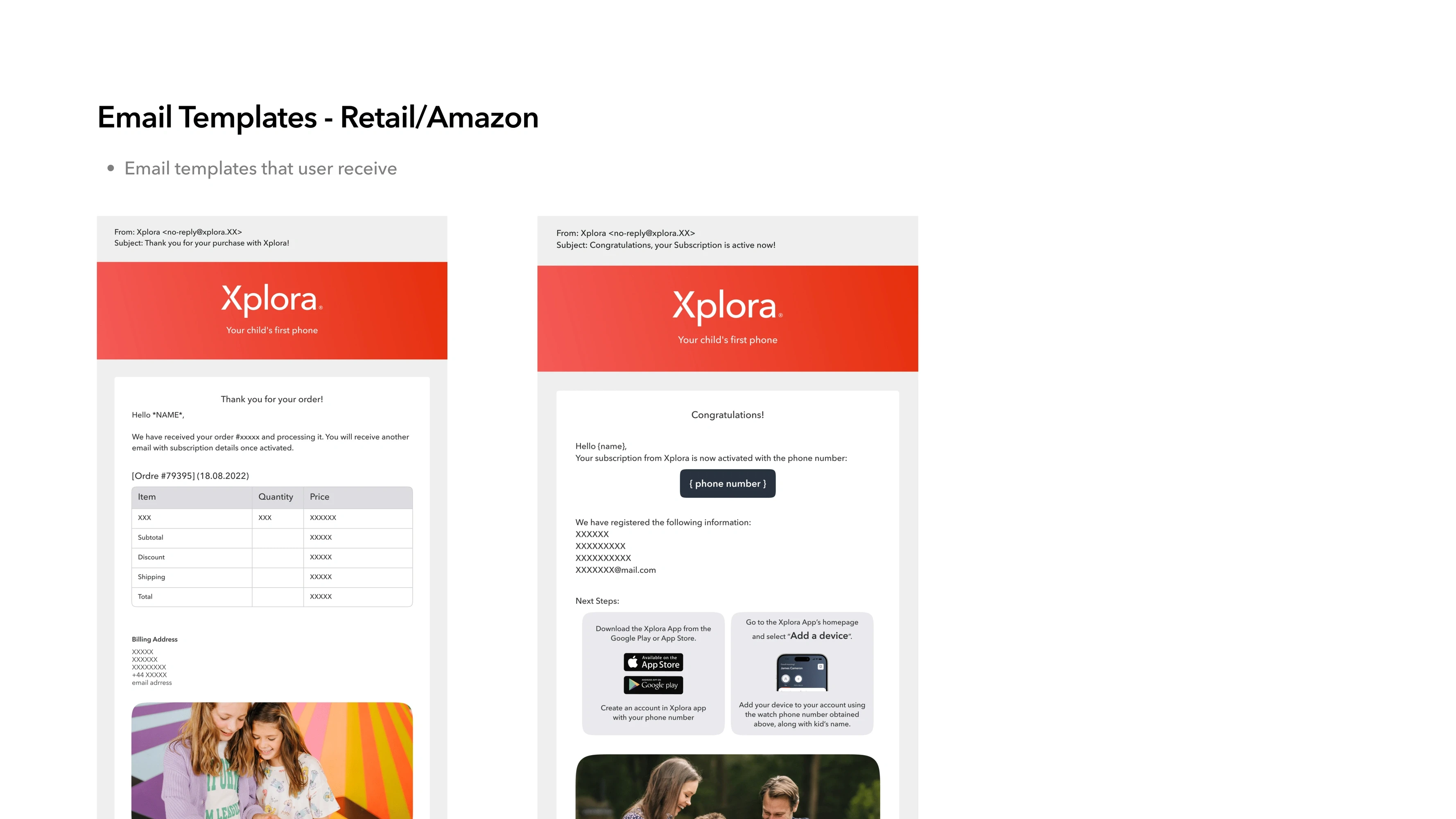
Connecting the parent and teen experiences
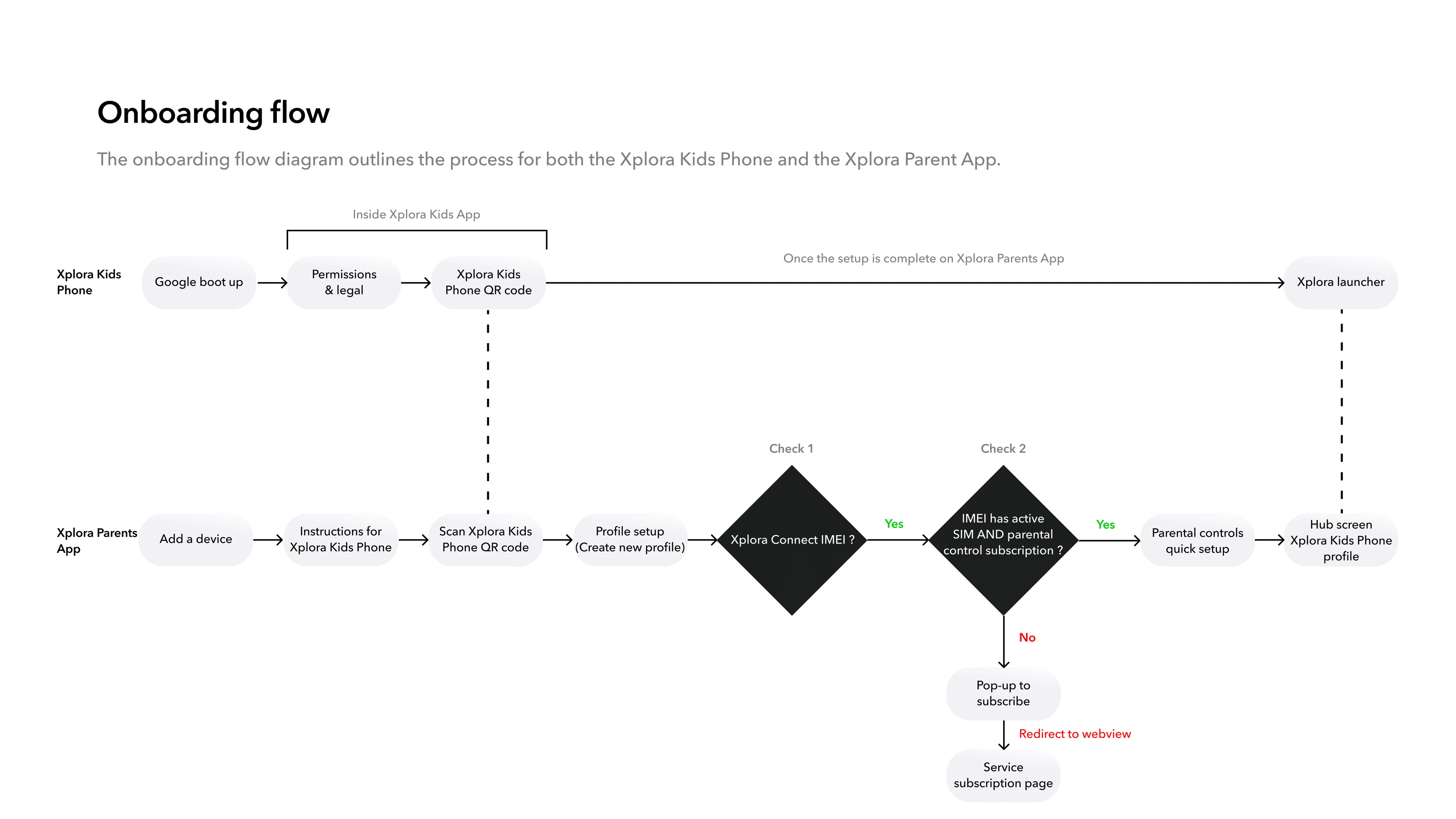
Once purchased, the smartphone and parent experience had to work together.
The journey needed to:
Set up the phone → Pair parent and teen → Confirm services → Configure parental controls → Enter daily use
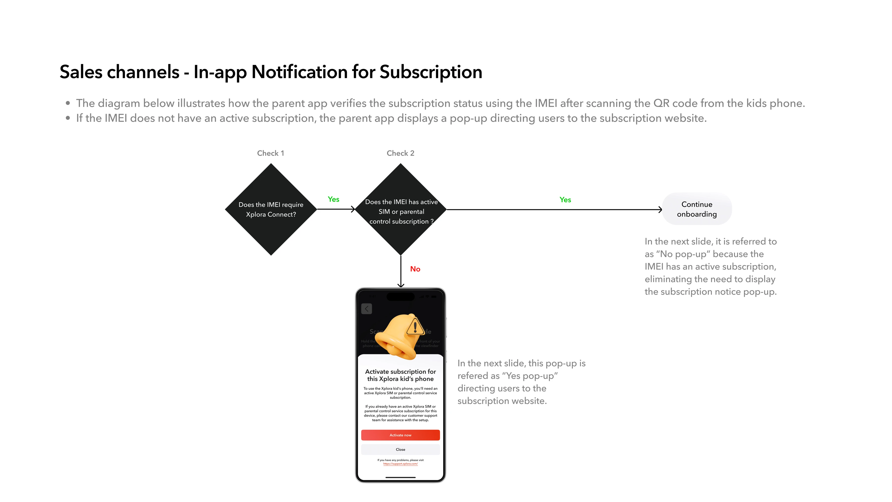
Different subscription states could require different paths, but users shouldn’t need to understand the technical dependencies underneath them.
Why: setting up a teen smartphone should feel like setting up one product — not configuring several connected systems.
The cross-device experience surfaced only the decisions the family actually needed to make.

The next challenge was deciding what parental control should actually feel like.
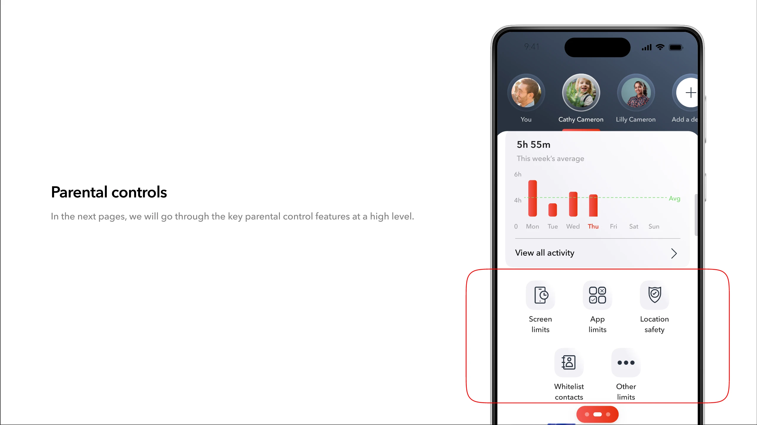
I worked across experiences including:
01 — Screen-time analytics
02 — Screen-time modes
03 — App timer
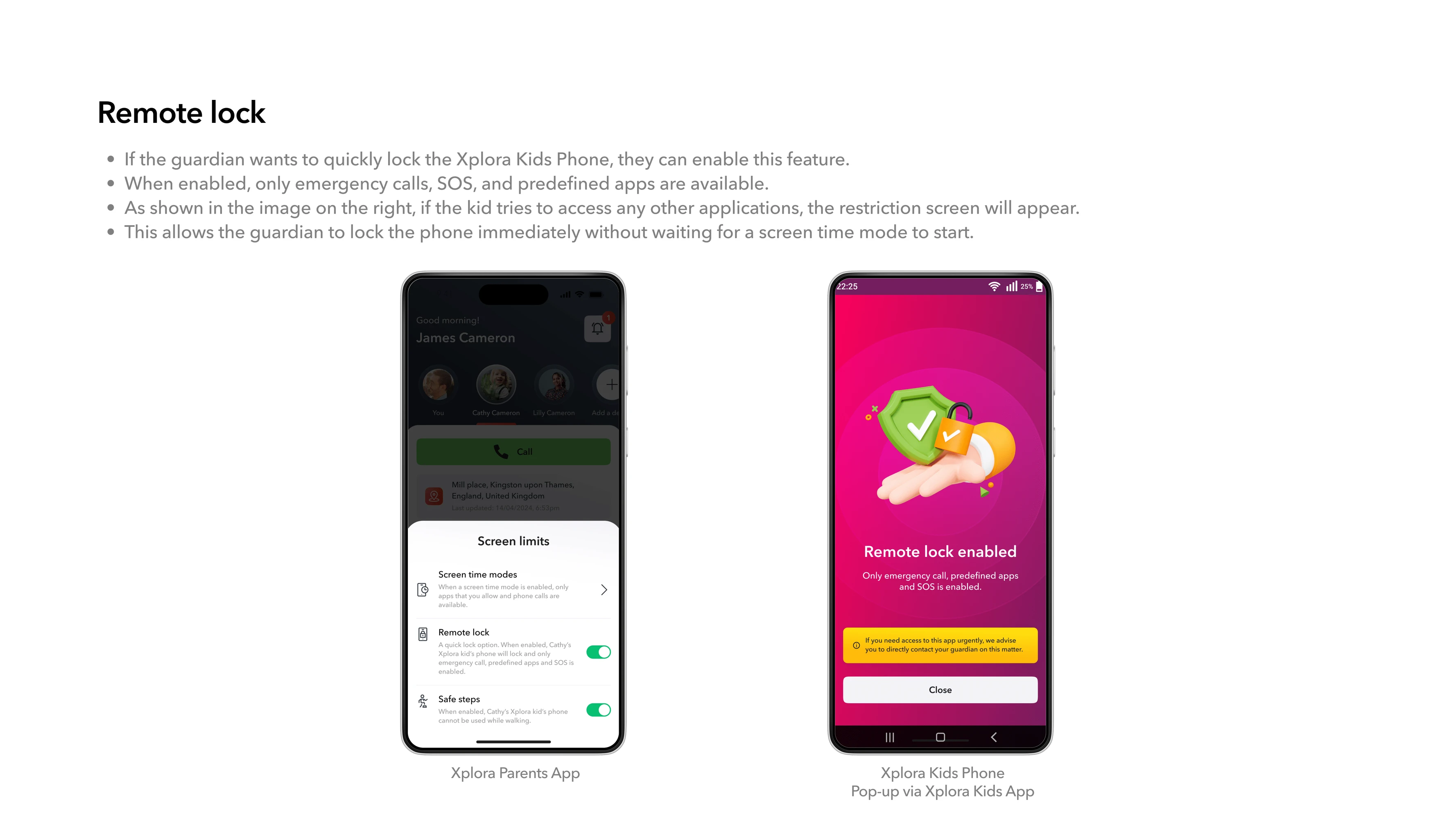
04 — Remote Lock
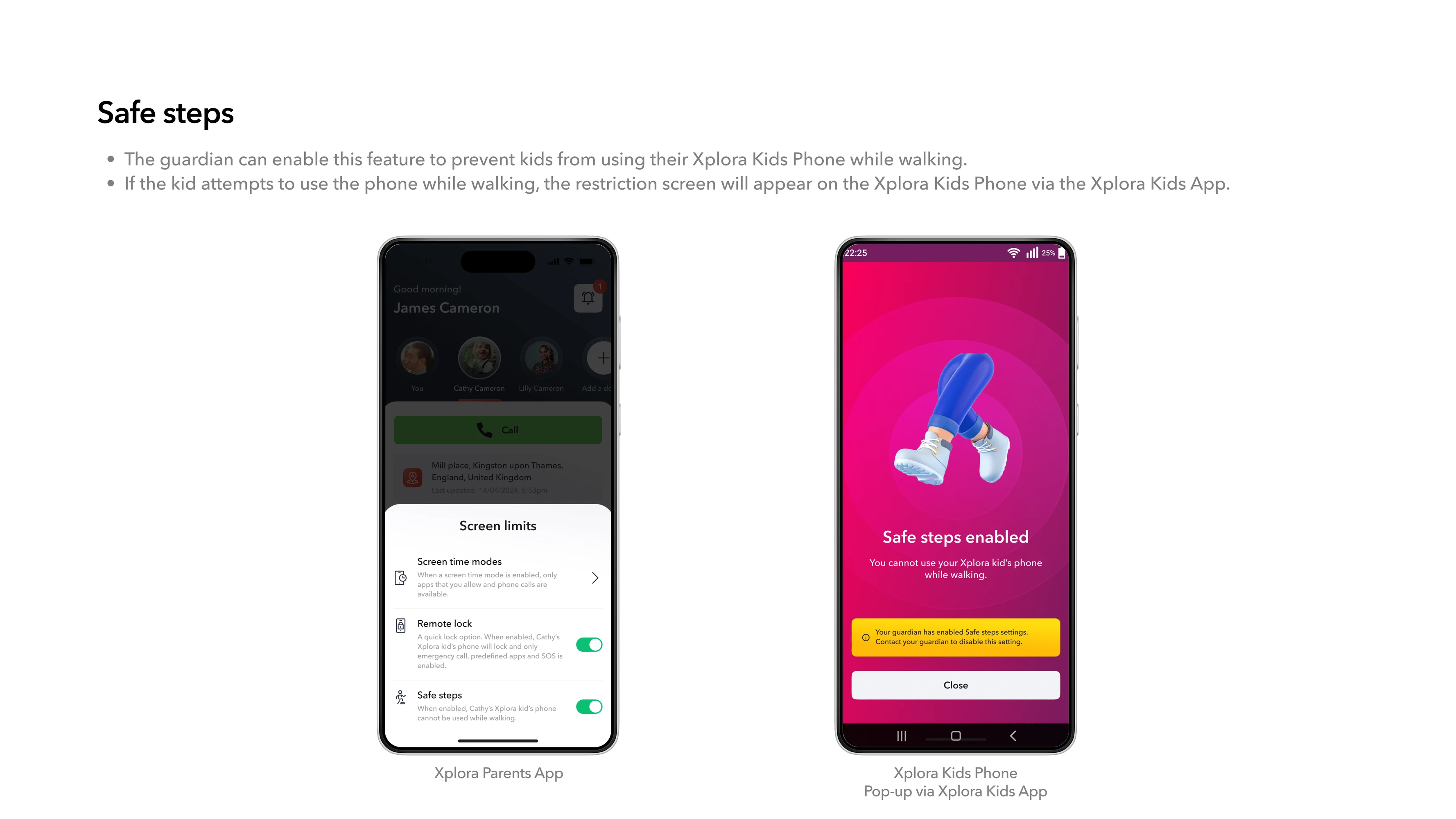
05 — Safe Steps
06 — Location safety
07— Whitelisted contacts
08 — Additional restrictions
But simply offering more settings wasn’t enough.
Parents needed to understand:
01 — What can I control?
02 — What is happening now?
03 — What happens when I change this?
So controls were designed around real family situations, not technical settings.
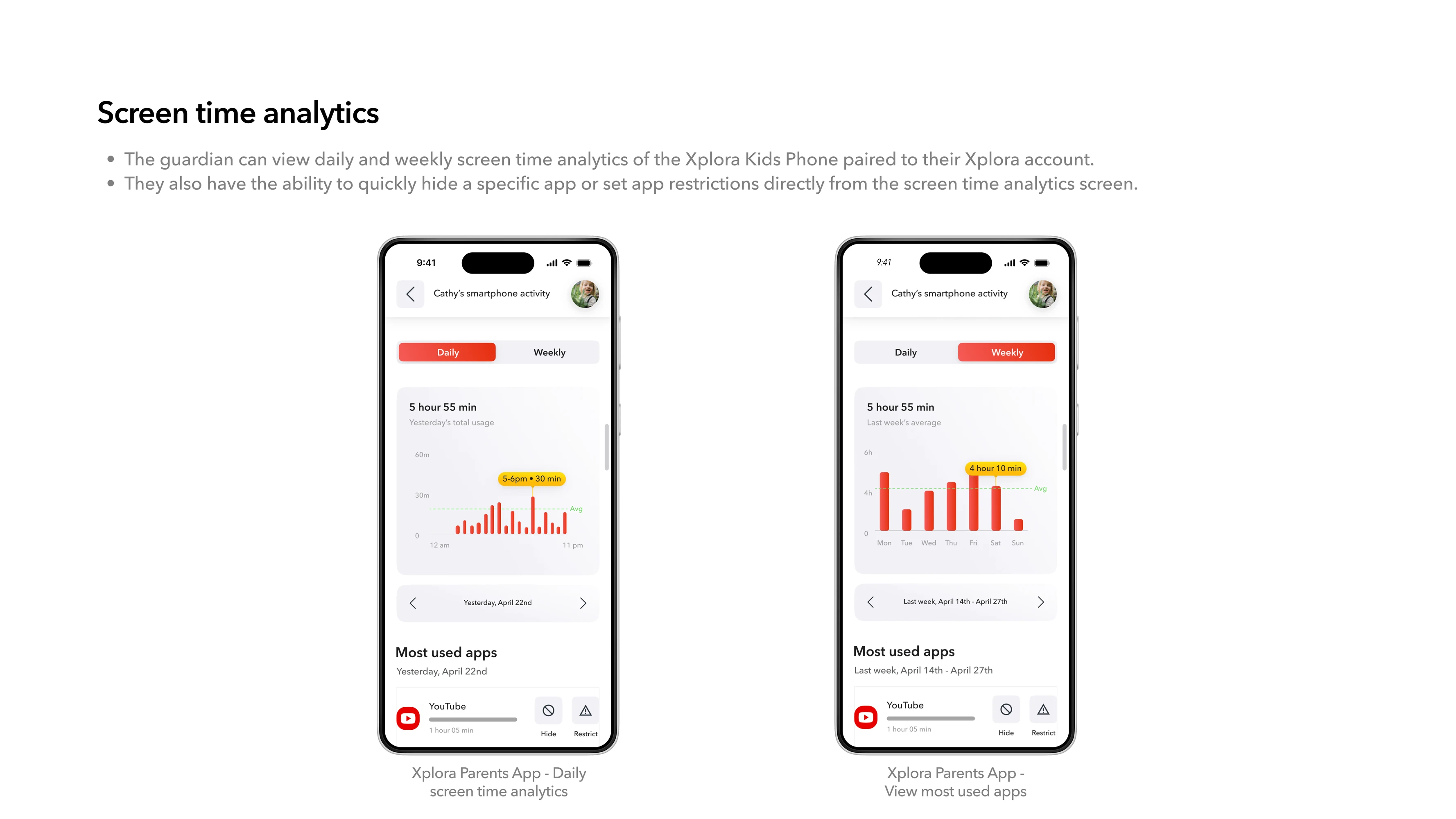
01 — Turn screen-time data into action: Parents could understand daily and weekly screen-time patterns and most-used apps, then move directly towards setting limits.
02 — Build controls around routines: Parents could create modes around situations such as school or bedtime, defining when restrictions started, ended and which apps remained available.
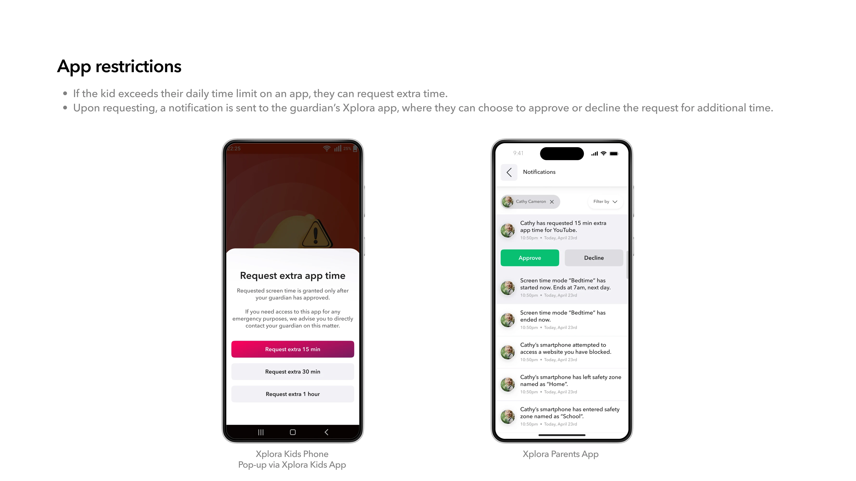
03 — Support immediate intervention: For moments requiring immediate action, parents could use Remote Lock. Safe Steps could reduce distracting phone use while walking, while app-level restrictions provided more granular control. Different situations required different levels of intervention.

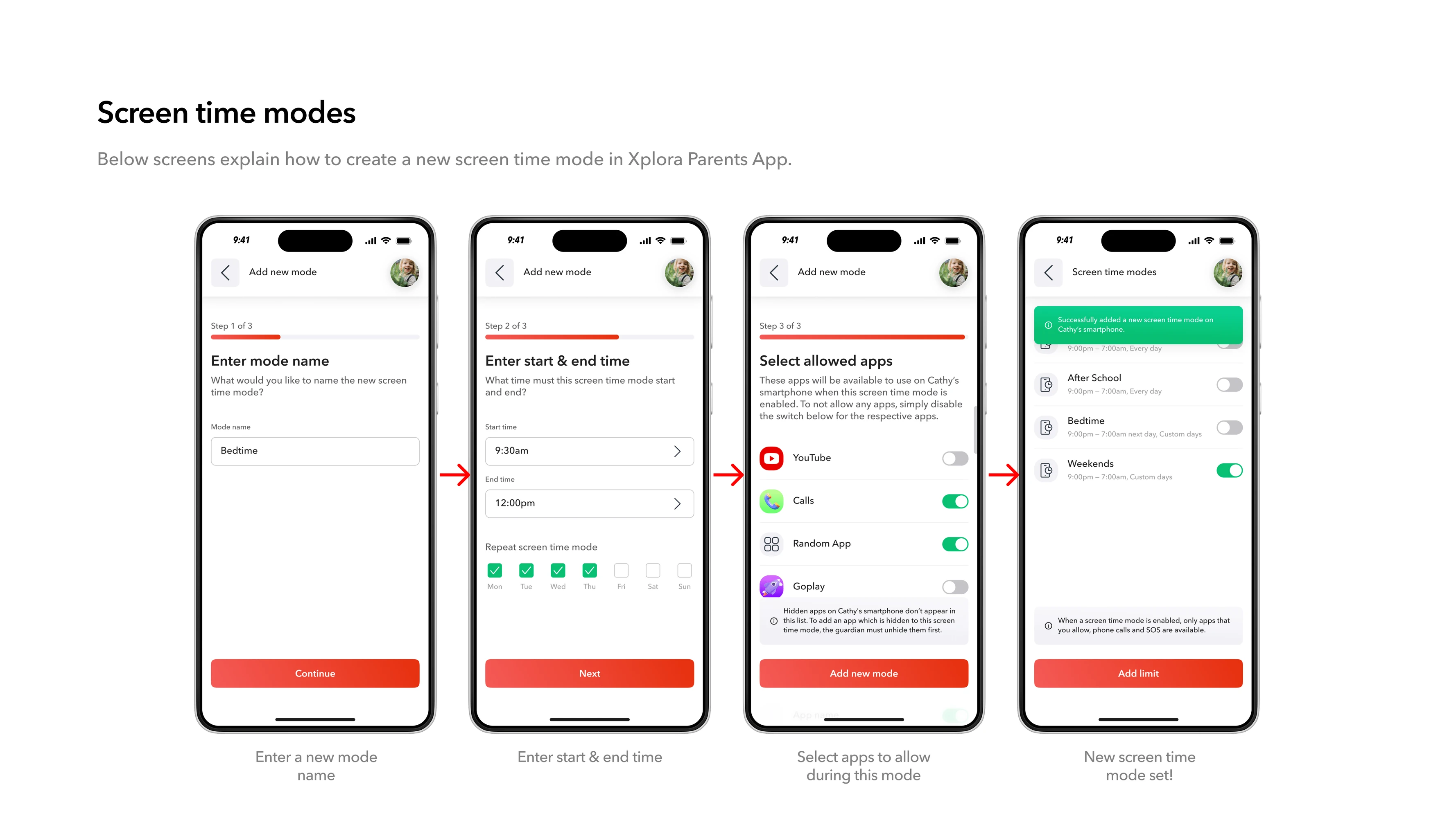
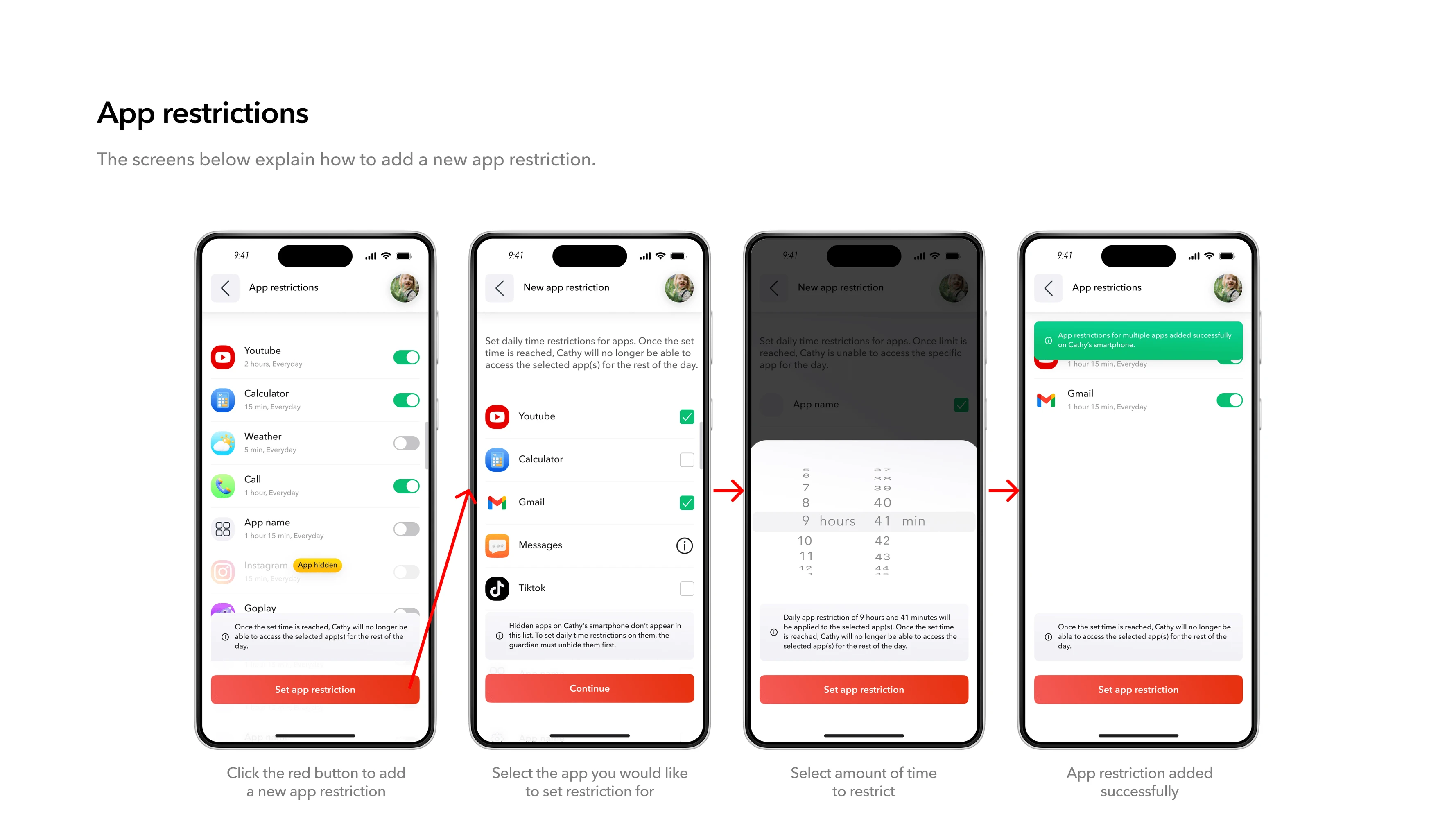
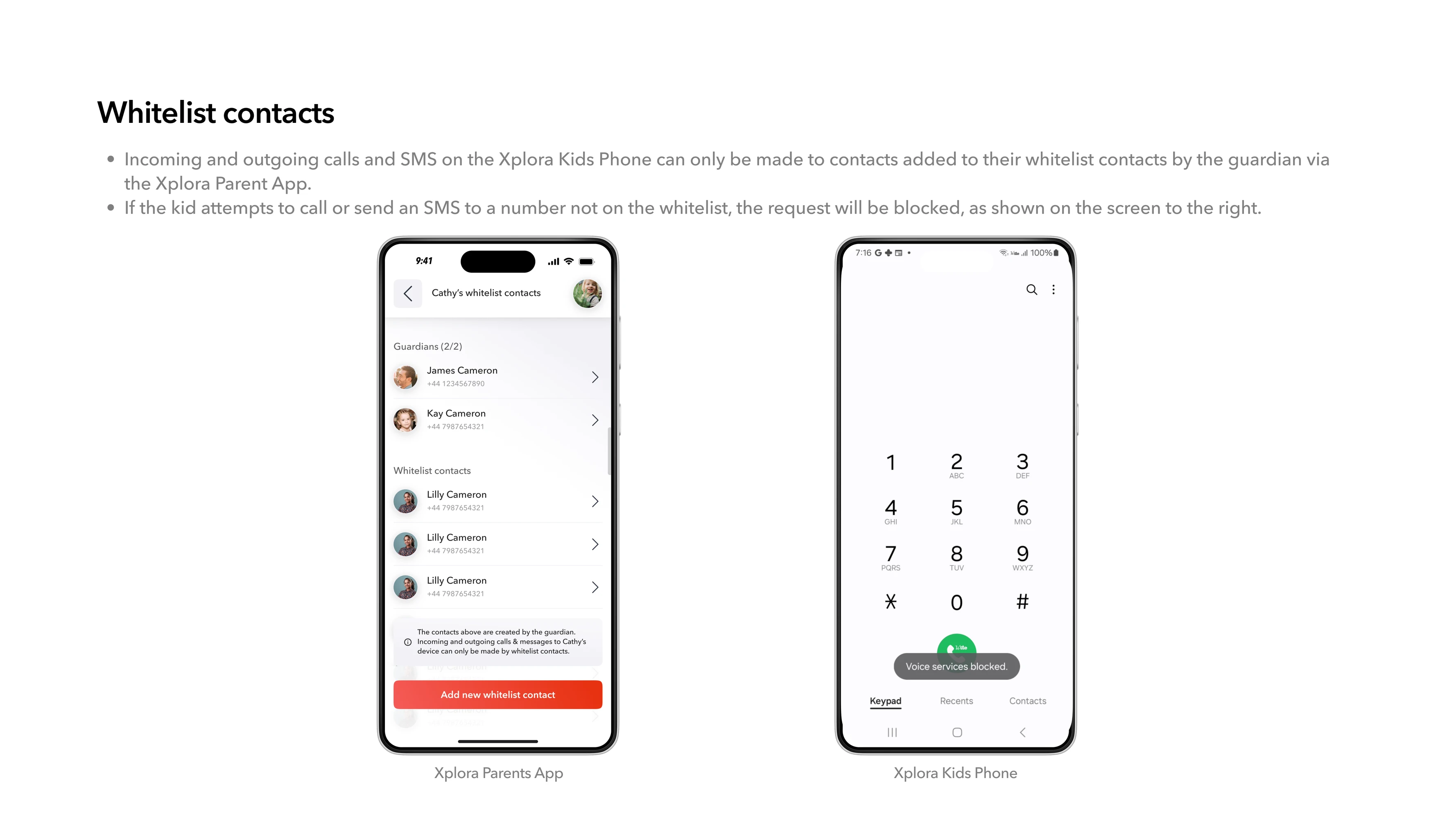
Parental control has two users. Designing only for the parent would leave the teenager experiencing restrictions they didn’t understand.
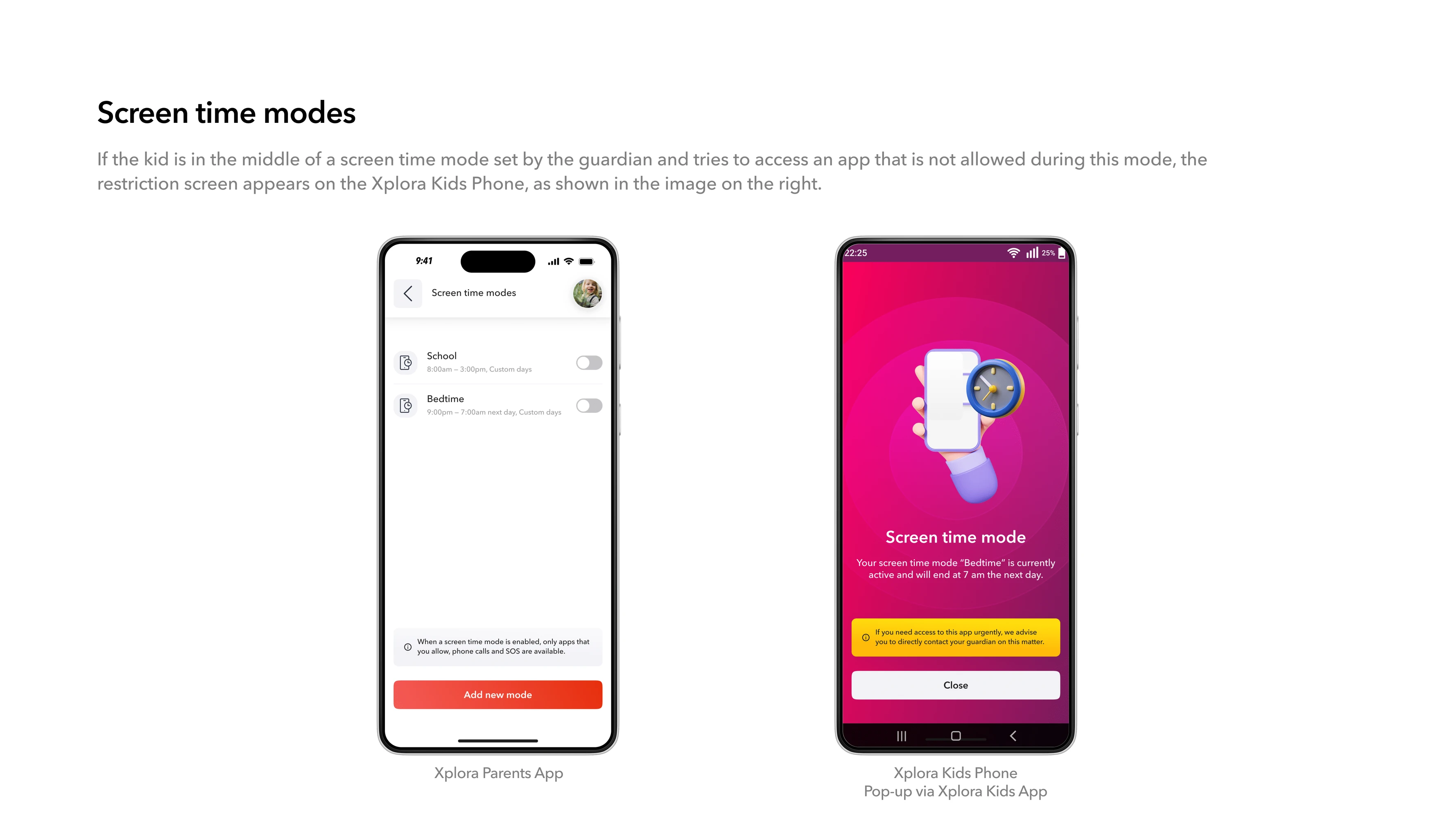
For example: For app timer, the experience could also allow the teen to request additional time from the parent. Instead of: “My phone blocked me.”
The experience became: “A rule is active, I understand why, and I know what I can do next.”
Parental control became a conversation rather than simply a lock.

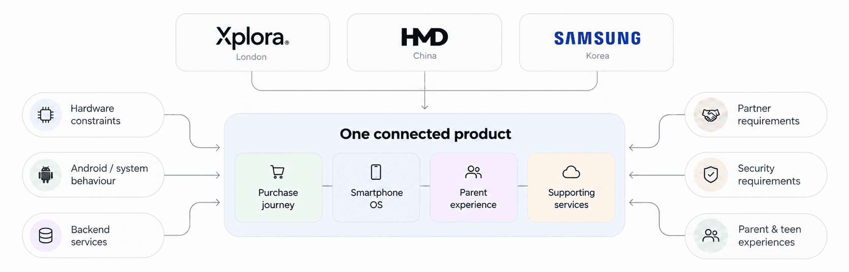
The product was developed across three companies and three countries, with teams in London, China and Korea. Every decision had to work across:
01 — Hardware constraints
02 — Android/system behaviour
03 — Backend services
04 — Partner requirements
05 — Security requirements
06 — Parent and teen experiences
That meant my role went beyond creating screens. I worked across Product, Design and Engineering to ensure the purchase journey, smartphone, parent experience and supporting services behaved like one connected product.
A solution couldn’t just work beautifully in Figma. It had to work across the system.
The work created the end-to-end experience across:
01 — 10 purchase scenarios
02 — 4 sales channels
03 — Purchase & activation
04 — Cross-device onboarding
05 — Parental-control setup
06 — Screen-time management
07 — Remote safety controls
08 — App restrictions
09 — Teen-side restriction states
The larger impact was simplification.
A complicated network of hardware, subscriptions, services, sales channels and parental controls was turned into an experience families could use without needing to understand the infrastructure underneath it.
The hardest part of designing a safe smartphone wasn’t adding more parental controls. It was making commerce, activation, hardware, software, parent experience and teen experience operate as one system.
And safety couldn’t come entirely at the teenager’s expense. A product designed only for parents risks becoming something teens fight against. A product designed only for teens risks losing parental trust. The strongest safety experience is one both sides can understand, trust and live with.

Keep exploring

